Store locations
Overview:
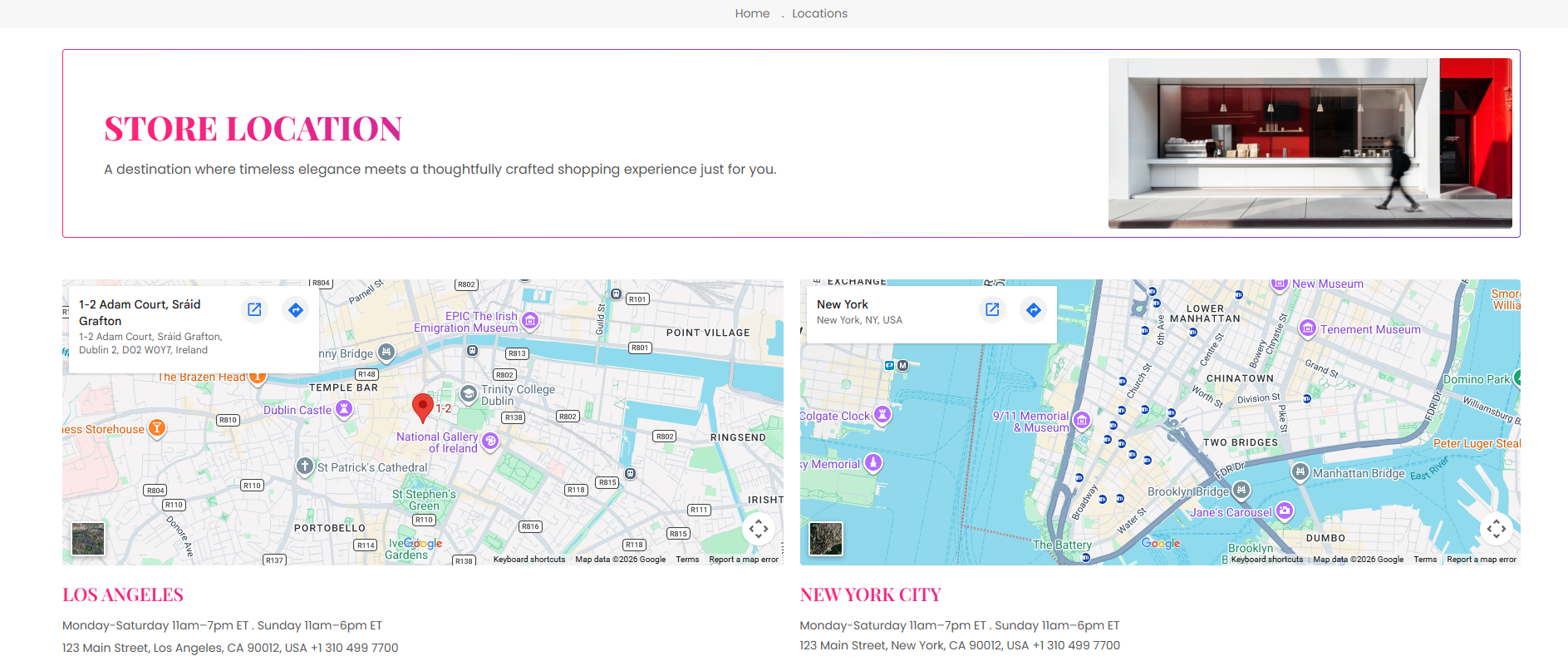
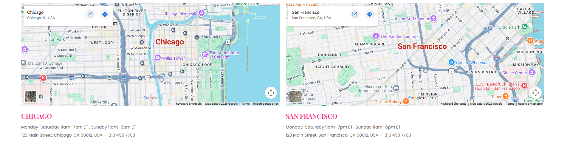
The Store Locator section is designed to display physical store locations, branch details, maps, operating hours, and contact information in a structured layout. It supports embedded maps, banners, location cards, responsive grids, typography customization, color schemes, and spacing controls to help customers easily find nearby store locations and business details.
Blocks Configuration
Location Block:
The Location block displays an individual store location with map integration and store information.
Map Settings:
| Setting |
Description |
| Map Iframe |
Adds a Google Maps or custom embedded map iframe for the store location. |
Store Heading:
| Setting |
Description |
| Store Heading |
Defines the title displayed for the store location. |
| Heading Size |
Controls the size of the store heading text. |
| Heading Weight |
Adjusts the font thickness of the store heading text. |
| Heading Case |
Changes the text transformation style such as uppercase, lowercase, capitalize, or default. |
| Heading Tag |
Sets the HTML heading tag level from H1 to H6 for SEO and accessibility purposes. |
| Heading Font Family |
Allows switching between default and body font family styles. |
| Heading Color Style |
Applies predefined color styling to the store heading text. |
| Heading Link Style |
Controls the styling behavior of links used inside the heading content. |
| Enable Heading Gradient |
Enables gradient styling for the store heading text. |
Store Description:
| Setting |
Description |
| Store Description |
Displays business hours, address, contact details, or additional store information. |
| Description Size |
Controls the size of the description text. |
| Description Weight |
Adjusts the font thickness of the description text. |
| Description Case |
Changes the text transformation style for description text. |
| Description Font Family |
Allows switching between default and heading font family styles. |
| Description Color Style |
Applies predefined color styling to the description text. |
Section Configuration
Breadcrumb:
| Setting |
Description |
| Show Breadcrumb |
Displays breadcrumb navigation above the store locator section for improved navigation and SEO structure. |
| Breadcrumb Color Scheme |
Applies a predefined color palette to the breadcrumb section. |
Banner:
| Setting |
Description |
| Banner Image |
Uploads a banner image displayed at the top of the store locator section. |
| Banner Media Ratio |
Controls the aspect ratio of the banner image such as adapt, square, portrait, landscape, or fit to box. |
| Banner Desktop Height |
Controls the height of the banner image on desktop devices when fit mode is enabled. |
| Banner Mobile Height |
Controls the height of the banner image on mobile devices when fit mode is enabled. |
Heading:
| Setting |
Description |
| Section Heading |
Defines the main heading displayed above the store locations. |
| Heading Size |
Controls the size of the heading text. |
| Heading Weight |
Adjusts the font thickness of the heading text. |
| Heading Case |
Changes the text transformation style such as uppercase, lowercase, capitalize, or default. |
| Heading Tag |
Sets the HTML heading tag level from H1 to H6 for SEO and accessibility purposes. |
| Heading Font Family |
Allows switching between default and body font family styles. |
| Heading Color Style |
Applies predefined color styling to the heading text. |
| Heading Link Style |
Controls the styling behavior of links used inside the heading content. |
Grid Settings:
| Setting |
Description |
| Desktop Columns |
Controls the number of location cards displayed on desktop devices. |
| Mobile Columns |
Controls the number of location cards displayed on mobile devices. |
| Desktop Grid Spacing |
Adds spacing between location cards on desktop devices. |
| Mobile Grid Spacing |
Adds spacing between location cards on mobile devices. |
Layout:
| Setting |
Description |
| Container Layout |
Determines whether the section uses a contained, contained content, or full-width layout. |
| Container Width |
Controls the maximum width of the section container on desktop devices. |
| Text Alignment (Desktop) |
Sets the horizontal alignment of section content on desktop devices. |
| Text Alignment (Mobile) |
Sets the horizontal alignment of section content on mobile devices. |
The Store Locator Overlay section is designed for popup overlays or modal-based store location displays. It allows merchants to showcase multiple store branches with expandable location rows, embedded maps, store timings, addresses, and contact details in a compact accordion layout. This section supports typography customization, gradient styling, collapsible rows, responsive spacing, and color schemes to improve customer accessibility and location discovery.
Blocks Configuration
Collapse Row Block:
The Collapse Row block displays an expandable store location with map integration and detailed store information.
Map Settings:
| Setting |
Description |
| Store Map |
Adds a Google Maps or custom embedded map iframe for the selected store location. |
Section Configuration
Color Scheme:
| Setting |
Description |
| Store Locator Color Scheme |
Applies a predefined color palette to the store locator overlay background and content. |
| Setting |
Description |
| Section Caption |
Displays a small introductory caption above the section heading. |
| Caption Size |
Controls the size of the caption text. |
| Caption Weight |
Adjusts the font thickness of the caption text. |
| Caption Case |
Changes the text transformation style such as uppercase, lowercase, capitalize, or default. |
Heading:
| Setting |
Description |
| Section Heading |
Defines the main heading displayed inside the overlay section. |
| Heading Size |
Controls the size of the heading text. |
| Heading Weight |
Adjusts the font thickness of the heading text. |
| Heading Case |
Changes the text transformation style such as uppercase, lowercase, capitalize, or default. |
| Heading Tag |
Sets the HTML heading tag level from H1 to H6 for SEO and accessibility purposes. |
| Heading Font Family |
Allows switching between default and body font family styles. |
| Heading Color Style |
Applies predefined color styling to the heading text. |
| Heading Link Style |
Controls the styling behavior of links used inside the heading content. |
| Enable Heading Gradient |
Enables gradient styling for the section heading. |
Description:
| Setting |
Description |
| Section Description |
Displays supporting content or introductory information below the section heading. |
| Description Size |
Controls the size of the description text. |
| Description Weight |
Adjusts the font thickness of the description text. |
| Description Case |
Changes the text transformation style for the description text. |
| Description Font Family |
Allows switching between default and heading font family styles. |
| Description Color Style |
Applies predefined color styling to the description text. |
