Smart table
Overview:
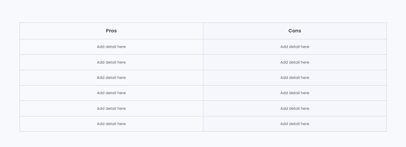
The Smart Table section is designed to create comparison-style tables for showcasing pros vs cons, feature comparisons, product advantages, service breakdowns, or informational side-by-side content. It supports customizable column headings, logos, typography controls, responsive layouts, rich text content, color schemes, and spacing settings. This section helps merchants present structured comparisons in a visually organized and easy-to-read format.
Blocks Configuration
Table Row Block
The Table Row block displays individual comparison rows between two columns.
First Column Content:
| Setting |
Description |
| First Column Description |
Displays rich text content inside the first comparison column. |
| First Column Text Size |
Controls the size of the first column text. |
| First Column Text Weight |
Adjusts the font thickness of the first column text. |
| First Column Text Case |
Changes the text transformation style such as uppercase, lowercase, capitalize, or default. |
| First Column Font Family |
Allows switching between default and heading font family styles. |
| First Column Color Style |
Applies predefined color styling to the first column content. |
Second Column Content:
| Setting |
Description |
| Second Column Description |
Displays rich text content inside the second comparison column. |
| Second Column Text Size |
Controls the size of the second column text. |
| Second Column Text Weight |
Adjusts the font thickness of the second column text. |
| Second Column Text Case |
Changes the text transformation style such as uppercase, lowercase, capitalize, or default. |
| Second Column Font Family |
Allows switching between default and heading font family styles. |
| Second Column Color Style |
Applies predefined color styling to the second column content. |
Section Configuration
Heading:
| Setting |
Description |
| Section Heading |
Defines the main heading displayed above the smart table section. |
| Heading Size |
Controls the size of the heading text. |
| Heading Weight |
Adjusts the font thickness of the heading text. |
| Heading Case |
Changes the text transformation style such as uppercase, lowercase, capitalize, or default. |
| Heading Tag |
Sets the HTML heading tag level from H1 to H6 for SEO and accessibility purposes. |
| Heading Font Family |
Allows switching between default and body font family styles. |
| Heading Color Style |
Applies predefined color styling to the heading text. |
| Heading Link Style |
Controls the styling behavior of links used inside the heading content. |
| Enable Heading Gradient |
Enables gradient styling for the section heading. |
Description:
| Setting |
Description |
| Section Description |
Displays supporting content or introductory information below the section heading. |
| Description Size |
Controls the size of the description text. |
| Description Weight |
Adjusts the font thickness of the description text. |
| Description Case |
Changes the text transformation style for the description text. |
| Description Font Family |
Allows switching between default and heading font family styles. |
First Column Settings:
| Setting |
Description |
| First Column Heading |
Defines the heading displayed for the first comparison column. |
| First Column Heading Size |
Controls the size of the first column heading text. |
| First Column Heading Weight |
Adjusts the font thickness of the first column heading text. |
| First Column Heading Case |
Changes the text transformation style for the first column heading. |
| First Column Heading Font Family |
Allows switching between default and heading font family styles. |
| First Column Logo |
Uploads a logo image displayed inside the first column heading area. |
| First Column Logo Width (Desktop) |
Controls the logo width on desktop devices. |
| First Column Logo Width (Mobile) |
Controls the logo width on mobile devices. |
Second Column Settings:
| Setting |
Description |
| Second Column Heading |
Defines the heading displayed for the second comparison column. |
| Second Column Heading Size |
Controls the size of the second column heading text. |
| Second Column Heading Weight |
Adjusts the font thickness of the second column heading text. |
| Second Column Heading Case |
Changes the text transformation style for the second column heading. |
| Second Column Heading Font Family |
Allows switching between default and heading font family styles. |
| Second Column Logo |
Uploads a logo image displayed inside the second column heading area. |
| Second Column Logo Width (Desktop) |
Controls the logo width on desktop devices. |
| Second Column Logo Width (Mobile) |
Controls the logo width on mobile devices. |
Layout:
| Setting |
Description |
| Container Layout |
Determines whether the section uses a contained, contained content, or full-width layout. |
| Container Width |
Controls the maximum width of the section container on desktop devices. |
| Text Alignment (Desktop) |
Sets the horizontal alignment of section content on desktop devices. |
| Text Alignment (Mobile) |
Sets the horizontal alignment of section content on mobile devices. |
Color Scheme:
| Setting |
Description |
| Section Color Scheme |
Applies a predefined color palette to the smart table section background and content. |
| Inverse Color Scheme |
Inverts the selected color scheme styling for contrast variations. |
| Gradient Mode |
Enables gradient styling for the section background, widgets, or both. |
