Products insights
Overview:
The Products Insights section is designed to display product-related insights, features, benefits, specifications, and categorized information using a tab-based layout. It supports multiple tabsets with grouped feature columns, icons, headings, descriptions, buttons, typography customization, responsive grid layouts, border styling, and advanced spacing controls. This section helps merchants organize complex product information into clean, interactive tabs for better user experience and product education.
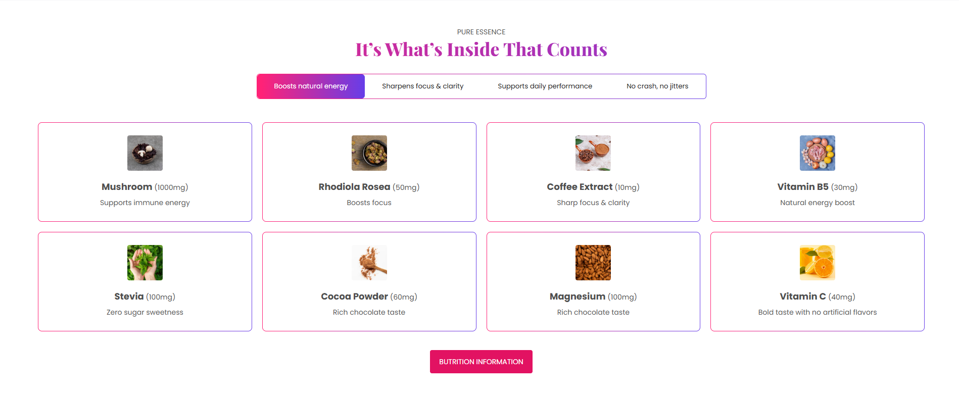
Blocks Configuration
Column Block
The Column block displays individual feature items linked to a specific tabset.
Content:
| Setting |
Description |
| Tabset Index |
Assigns the column item to a specific tab group or tabset. |
| Icon Image |
Uploads an icon displayed above the feature content. |
| Column Heading |
Defines the feature or insight heading text. |
| Column Description |
Displays supporting content or detailed information for the feature item. |
Tabset Block:
The Tabset block creates category tabs used to organize grouped product insights.
| Setting |
Description |
| Tabset Label |
Defines the tab title displayed inside the section navigation. |
Section Configuration
Caption:
| Setting |
Description |
| Section Caption |
Displays a small introductory caption above the section heading. |
| Caption Size |
Controls the size of the caption text. |
| Caption Weight |
Adjusts the font thickness of the caption text. |
| Caption Case |
Changes the text transformation style such as uppercase, lowercase, capitalize, or default. |
| Caption Font Family |
Allows switching between default and heading font family styles. |
Heading:
| Setting |
Description |
| Section Heading |
Defines the main heading displayed inside the section. |
| Heading Size |
Controls the size of the heading text. |
| Heading Weight |
Adjusts the font thickness of the heading text. |
| Heading Case |
Changes the text transformation style such as uppercase, lowercase, capitalize, or default. |
| Heading Tag |
Sets the HTML heading tag level from H1 to H6 for SEO and accessibility purposes. |
| Heading Font Family |
Allows switching between default and body font family styles. |
| Heading Color Style |
Applies predefined color styling to the heading text. |
| Enable Heading Gradient |
Enables gradient styling for the section heading. |
Description:
| Setting |
Description |
| Section Description |
Displays supporting content or introductory information below the section heading. |
| Description Size |
Controls the size of the description text. |
| Description Weight |
Adjusts the font thickness of the description text. |
| Description Case |
Changes the text transformation style for the description text. |
| Description Font Family |
Allows switching between default and heading font family styles. |
| Description Color Style |
Applies predefined color styling to the description text. |
| Setting |
Description |
| Button Label |
Defines the text displayed on the section button. |
| Button Link |
Adds a URL link to the section button. |
| Button Style |
Controls the visual appearance of the button such as primary, secondary, or link style. |
| Button Case |
Changes the text transformation style for button text. |
| Open in New Tab |
Opens the button link in a new browser tab when enabled. |
Column Typography Settings
Icon Settings:
| Setting |
Description |
| Column Icon Size |
Controls the size of icons displayed inside feature columns by default it id 70px. |
Column Heading Typography:
| Setting |
Description |
| Column Heading Size |
Controls the size of feature headings. |
| Column Heading Weight |
Adjusts the font thickness of feature headings. |
| Column Heading Case |
Changes the text transformation style for feature headings. |
| Column Heading Tag |
Sets the HTML heading tag level for feature headings. |
| Column Heading Font Family |
Allows switching between default and body font family styles. |
| Column Heading Color Style |
Applies predefined color styling to feature headings. |
| Enable Column Heading Gradient |
Enables gradient styling for column headings. |
Column Description Typography:
| Setting |
Description |
| Column Description Size |
Controls the size of feature descriptions. |
| Column Description Weight |
Adjusts the font thickness of feature descriptions. |
| Column Description Case |
Changes the text transformation style for feature descriptions. |
| Column Description Font Family |
Allows switching between default and heading font family styles. |
| Column Description Color Style |
Applies predefined color styling to feature descriptions. |
Grid Settings:
| Setting |
Description |
| Desktop Columns |
Controls the number of feature columns displayed on desktop devices. |
| Mobile Columns |
Controls the number of feature columns displayed on mobile devices. |
| Desktop Grid Spacing |
Adds spacing between feature columns on desktop devices. |
| Mobile Grid Spacing |
Adds spacing between feature columns on mobile devices. |
Layout:
| Setting |
Description |
| Row Border Style |
Controls the border appearance style such as solid or dashed. |
| Container Layout |
Determines whether the section uses a contained, contained content, or full-width layout. |
| Container Width |
Controls the maximum width of the section container on desktop devices. |
| Text Alignment (Desktop) |
Sets the horizontal alignment of section content on desktop devices. |
| Text Alignment (Mobile) |
Sets the horizontal alignment of section content on mobile devices. |
Color Scheme:
| Setting |
Description |
| Section Color Scheme |
Applies a predefined color palette to the section background and content. |
| Inverse Color Scheme |
Inverts the selected color scheme styling for contrast variations. |
| Gradient Mode |
Enables gradient styling for the section background. |
