Value grid
Overview:
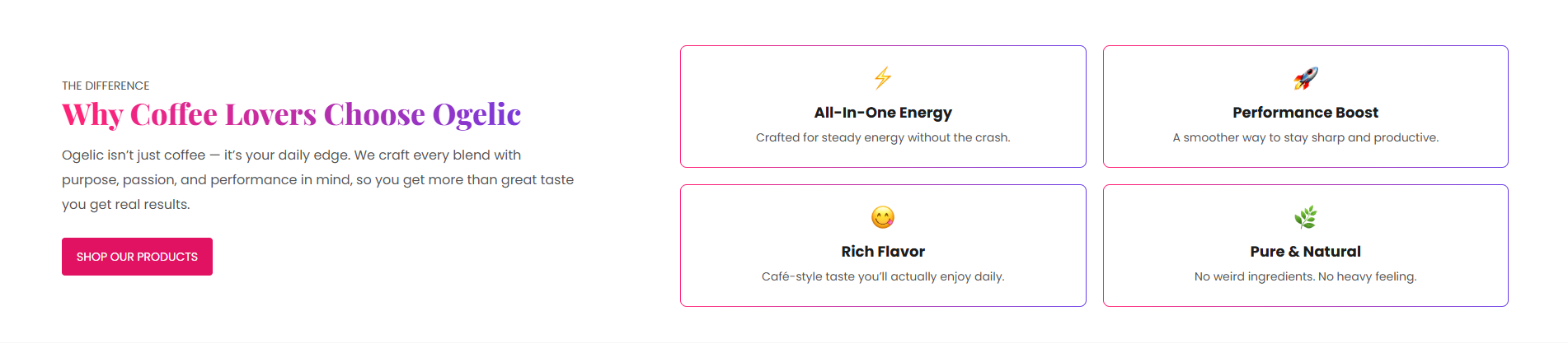
The Value Grid section is designed to showcase brand values, key features, benefits, service highlights, or business strengths in a structured column-based layout. It supports customizable headings, captions, descriptions, buttons, icon-based columns, typography styling, responsive grid spacing, layout positioning, color schemes, and spacing controls. This section helps merchants visually communicate trust, quality, and unique selling points to customers.
Blocks Configuration
Column Block:
The Column block displays individual value items with an icon, heading, and supporting description.
| Setting |
Description |
| Column Image |
Uploads an icon or image displayed above the column content. |
| Column Heading |
Defines the main heading displayed for the value item. |
| Column Description |
Displays supporting text or detailed information below the column heading. |
Section Configuration
Caption:
| Setting |
Description |
| Caption Text |
Displays a small introductory caption above the section heading. |
| Caption Size |
Controls the size of the caption text. |
| Caption Weight |
Adjusts the font thickness of the caption text. |
| Caption Case |
Changes the text transformation style such as uppercase, lowercase, capitalize, or default. |
| Caption Font Family |
Allows switching between default and heading font family styles. |
| Caption Color Style |
Applies predefined color styling to the caption text. |
Heading:
| Setting |
Description |
| Section Heading |
Defines the main heading displayed inside the section. |
| Heading Size |
Controls the size of the heading text. |
| Heading Weight |
Adjusts the font thickness of the heading text. |
| Heading Case |
Changes the text transformation style such as uppercase, lowercase, capitalize, or default (H2). |
| Heading Tag |
Sets the HTML heading tag level from H1 to H6 for SEO and accessibility purposes. |
| Heading Font Family |
Allows switching between default and body font family styles. |
| Heading Color Style |
Applies predefined color styling to the heading text. |
| Heading Link Style |
Controls the styling behavior of links used inside the heading content. |
| Enable Heading Gradient |
Enables gradient styling for the heading text. |
Description:
| Setting |
Description |
| Description Text |
Displays supporting content or introductory information below the section heading. |
| Description Size |
Controls the size of the description text. |
| Description Weight |
Adjusts the font thickness of the description text. |
| Description Case |
Changes the text transformation style for the description text. |
| Description Font Family |
Allows switching between default and heading font family styles. |
| Description Color Style |
Applies predefined color styling to the description text. |
| Setting |
Description |
| Button Label |
Defines the text displayed on the section button. |
| Button Link |
Adds a URL link to the section button. |
| Button Style |
Controls the visual appearance of the button such as primary, secondary, or link style. |
| Button Case |
Changes the text transformation style for button text. |
| Open in New Tab |
Opens the button link in a new browser tab when enabled. |
Column Settings:
| Setting |
Description |
| Column Icon Size |
Controls the size of icons displayed inside each column by default its is 30px. |
| Column Heading Size |
Controls the size of column headings. |
| Column Heading Weight |
Adjusts the font thickness of column headings. |
| Column Heading Case |
Changes the text transformation style for column headings. |
| Column Heading Tag |
Sets the HTML heading tag level for column headings. |
| Column Heading Font Family |
Allows switching between default and body font family styles. |
| Column Heading Color Style |
Applies predefined color styling to column headings. |
| Column Heading Link Style |
Controls the styling behavior of links used inside column headings. |
| Enable Column Heading Gradient |
Enables gradient styling for column headings. |
| Column Description Size |
Controls the size of column description text. |
| Column Description Weight |
Adjusts the font thickness of column descriptions. |
| Column Description Case |
Changes the text transformation style for column descriptions. |
| Column Description Font Family |
Allows switching between default and heading font family styles. |
| Column Description Color Style |
Applies predefined color styling to column descriptions. |
Grid Settings
| Setting |
Description |
| Desktop Grid Spacing |
Adds spacing between columns on desktop devices. |
| Mobile Grid Spacing |
Adds spacing between columns on mobile devices. |
Layout
| Setting |
Description |
| Content Position |
Controls whether content appears first or second on desktop layouts. |
| Container Layout |
Determines whether the section uses a contained, contained content, or full-width layout. |
| Container Width |
Controls the maximum width of the section container on desktop devices. |
| Text Alignment (Desktop) |
Sets the horizontal alignment of section content on desktop devices. |
| Text Alignment (Mobile) |
Sets the horizontal alignment of section content on mobile devices. |
Color Scheme
| Setting |
Description |
| Section Color Scheme |
Applies a predefined color palette to the section background and content. |
| Gradient Mode |
Enables gradient styling for the section background. |
Padding
| Setting |
Description |
| Top Padding (Desktop) |
Adds spacing inside the top area of the section on desktop devices by default it is 60px. |
| Bottom Padding (Desktop) |
Adds spacing inside the bottom area of the section on desktop devices by default it is 60px. |
| Left Padding (Desktop) |
Controls the inner left spacing of the section on desktop devices by default it is 75px. |
| Right Padding (Desktop) |
Controls the inner right spacing of the section on desktop devices by default it is 75px. |
| Top Padding (Mobile) |
Adds spacing inside the top area of the section on mobile devices by default it is 35px. |
| Bottom Padding (Mobile) |
Adds spacing inside the bottom area of the section on mobile devices by default it is 35px. |
| Left Padding (Mobile) |
Controls the inner left spacing of the section on mobile devices by default it is 10px. |
| Right Padding (Mobile) |
Controls the inner right spacing of the section on mobile devices by default it is 10px. |
