Media collapsibles
Overview:
The Media Collapsibles section combines media content with collapsible accordion rows to display FAQs, product details, brand stories, policies, tutorials, or informational content in an interactive layout. It supports images, videos, collapsible content rows, slideshow controls, typography customization, media positioning, gradient styling, responsive layouts, and advanced spacing controls. This section helps organize large amounts of content in a clean and user-friendly format.
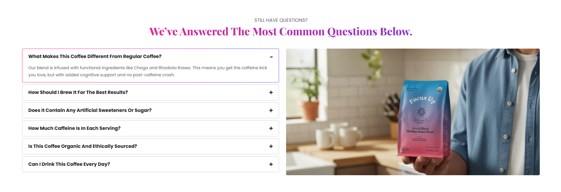
Section Configuration
Caption:
| Setting |
Description |
| Caption Text |
Displays a small introductory caption above the section heading. |
| Caption Size |
Controls the size of the caption text by default it is normal. |
| Caption Weight |
Adjusts the font thickness of the caption text. |
| Caption Case |
Changes the text transformation style such as uppercase, lowercase, capitalize, or default. |
| Caption Font Family |
Allows switching between default and heading font family styles. |
Heading:
| Setting |
Description |
| Section Heading |
Defines the main heading displayed inside the section. |
| Heading Size |
Controls the size of the heading text. |
| Heading Weight |
Adjusts the font thickness of the heading text. |
| Heading Case |
Changes the text transformation style such as uppercase, lowercase, capitalize, or default. |
| Heading Tag |
Sets the HTML heading tag level from H1 to H6 for SEO and accessibility purposes. |
| Heading Font Family |
Allows switching between default and body font family styles. |
| Heading Color Style |
Applies predefined color styling to the heading text. |
| Heading Link Style |
Controls the styling behavior of links used inside the heading content. |
| Enable Heading Gradient |
Enables gradient styling for the heading text. |
Description:
| Setting |
Description |
| Description Text |
Displays supporting text or introductory content below the section heading. |
| Description Size |
Controls the size of the description text. |
| Description Weight |
Adjusts the font thickness of the description text. |
| Description Case |
Changes the text transformation style for the description text. |
| Description Font Family |
Allows switching between default and heading font family styles. |
| Description Color Style |
Applies predefined color styling to the description text. |
| Setting |
Description |
| Header Position |
Controls whether the section header appears at the top, bottom, left, or right side of the media content. |
| Header Bottom Margin (Desktop) |
Adds spacing below the section header on desktop devices. |
| Header Bottom Margin (Mobile) |
Adds spacing below the section header on mobile devices. |
Collapsible Settings
| Setting |
Description |
| Enable Gradient Border |
Displays gradient borders around collapsible rows. |
| Enable Widget Color |
Enables custom widget color styling for collapsible content areas. |
| Border Style |
Controls the row border layout such as divided, boxed list, or default style. |
| Row Border Style |
Controls the border appearance style such as solid or dashed. |
Slideshow Settings
| Setting |
Description |
| Show Slideshow Arrows |
Displays navigation arrows for media slideshows. |
| Enable Auto Play |
Automatically rotates slideshow media content. |
| Slideshow Interval |
Controls the autoplay delay timing between slides. |
Layout
| Setting |
Description |
| Media Ratio |
Controls the aspect ratio of images and videos such as adapt, square, portrait, landscape, or fit to box. |
| Desktop Media Height |
Controls the media height on desktop devices when fit mode is enabled. |
| Mobile Media Height |
Controls the media height on mobile devices when fit mode is enabled. |
| Media Position |
Controls whether media appears before or after collapsible content. |
| Desktop Grid Spacing |
Adds spacing between media and collapsible content areas. |
| Container Layout |
Determines whether the section uses a contained, contained content, or full-width layout. |
| Container Width |
Controls the maximum width of the section container on desktop devices. |
| Text Alignment (Desktop) |
Sets the horizontal alignment of content on desktop devices. |
| Text Alignment (Mobile) |
Sets the horizontal alignment of content on mobile devices. |
Color Scheme
| Setting |
Description |
| Section Color Scheme |
Applies a predefined color palette to the section background and content. |
| Inverse Color Scheme |
Inverts the selected color scheme styling for contrast variations. |
| Gradient Mode |
Enables gradient styling for the section background, widgets, or both. |
| Enable Heading Gradient |
Enables gradient styling for section headings. |
Blocks Configuration
Collapse Row Block:
The Collapse Row block creates expandable accordion-style content areas.
Content
| Setting |
Description |
| Icon Image |
Uploads an icon displayed beside the collapsible heading. |
| Heading |
Defines the collapsible row heading text. |
| Heading Size |
Controls the size of the collapsible heading text. |
| Heading Weight |
Adjusts the font thickness of the heading text. |
| Heading Case |
Changes the text transformation style for heading text. |
| Heading Font Family |
Allows switching between body and heading font family styles. |
| Enable Heading Gradient |
Enables gradient styling for collapsible headings. |
| Description Content |
Displays detailed accordion content inside the collapsible row. |
| Description Size |
Controls the size of the description text. |
| Description Weight |
Adjusts the font thickness of description content. |
| Description Case |
Changes the text transformation style for descriptions. |
| Description Font Family |
Allows switching between default and heading font family styles. |
| Description Color Style |
Applies predefined color styling to description text. |
Layout:
| Setting |
Description |
| Default Open |
Keeps the collapsible row expanded by default when enabled. |
Spacing:
| Setting |
Description |
| Bottom Margin (Desktop) |
Adds spacing below the collapsible row on desktop devices. |
| Bottom Margin (Mobile) |
Adds spacing below the collapsible row on mobile devices. |
Video Block
The Video block displays uploaded or embedded videos inside the section.
| Setting |
Description |
| Cover Image |
Uploads a preview thumbnail image for the video. |
| Shopify Hosted Video |
Uploads a video directly to Shopify for playback. |
| Embedded Video URL |
Adds YouTube or Vimeo video URLs for embedded playback. |
Image Block
The Image block displays banner or supporting images inside the section.
| Setting |
Description |
| Banner Image |
Uploads an image displayed inside the media section. |
Padding
| Setting |
Description |
| Top Padding (Desktop) |
Adds spacing inside the top area of the section on desktop devices. |
| Bottom Padding (Desktop) |
Adds spacing inside the bottom area of the section on desktop devices. |
| Left Padding (Desktop) |
Controls the inner left spacing of the section on desktop devices. |
| Right Padding (Desktop) |
Controls the inner right spacing of the section on desktop devices. |
| Top Padding (Mobile) |
Adds spacing inside the top area of the section on mobile devices. |
| Bottom Padding (Mobile) |
Adds spacing inside the bottom area of the section on mobile devices. |
| Left Padding (Mobile) |
Controls the inner left spacing of the section on mobile devices. |
| Right Padding (Mobile) |
Controls the inner right spacing of the section on mobile devices. |
