Before and After
Overview:
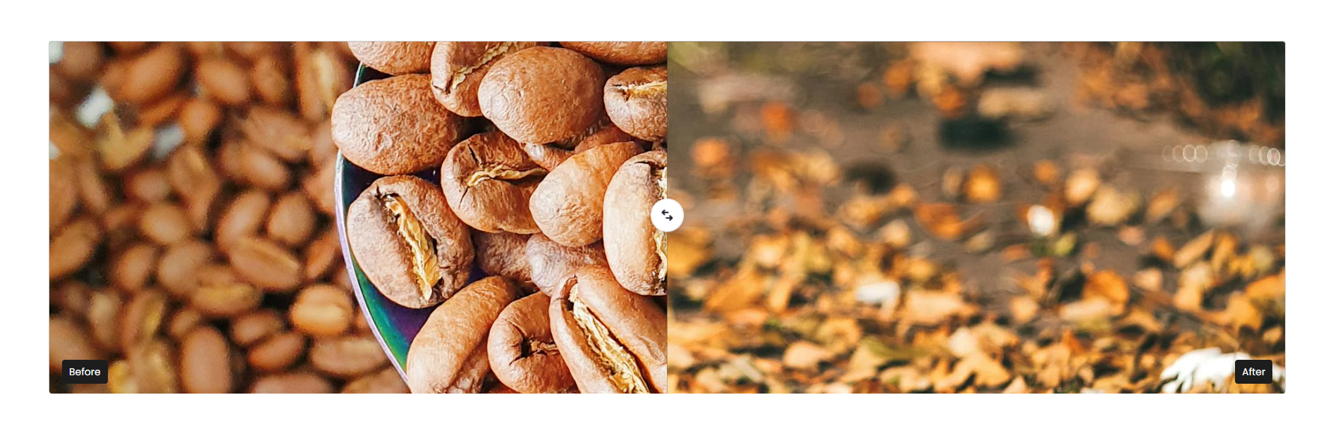
The Before / After Content section is designed to visually compare two images using an interactive slider. It is commonly used to showcase transformations, product improvements, results, comparisons, redesigns, or feature upgrades. The section supports before and after images, draggable comparison cursor, captions, typography customization, responsive media layouts, color schemes, and spacing controls for a visually engaging comparison experience.
Blocks Configuration
Before Block:
The Before block displays the original or comparison image shown before interaction.
| Setting |
Description |
| Desktop Image |
Uploads the image displayed on desktop devices for the Before state. |
| Mobile Image |
Uploads a separate image displayed on mobile devices for the Before state. |
Content Settings:
| Setting |
Description |
| Description Label |
Defines the text label displayed on the before image such as Before. |
| Description Size |
Controls the size of the label text. |
| Description Weight |
Adjusts the font thickness of the label text. |
| Description Case |
Changes the text transformation style such as uppercase, lowercase, capitalize, or default. |
| Description Font Family |
Allows switching between default and heading font family styles. |
| Block Color Scheme |
Applies a predefined color palette to the label container. |
After Block:
The After block displays the updated or transformed image shown after interaction.
| Setting |
Description |
| Desktop Image |
Uploads the image displayed on desktop devices for the After state. |
| Mobile Image |
Uploads a separate image displayed on mobile devices for the After state. |
Content Settings:
| Setting |
Description |
| Description Label |
Defines the text label displayed on the after image such as After. |
| Description Size |
Controls the size of the label text. |
| Description Weight |
Adjusts the font thickness of the label text. |
| Description Case |
Changes the text transformation style such as uppercase, lowercase, capitalize, or default. |
| Description Font Family |
Allows switching between default and heading font family styles. |
| Block Color Scheme |
Applies a predefined color palette to the label container. |
Section Configuration
| Setting |
Description |
| Section Caption |
Displays a small introductory caption above the section heading. |
| Caption Size |
Controls the size of the caption text. |
| Caption Weight |
Adjusts the font thickness of the caption text. |
| Caption Case |
Changes the text transformation style such as uppercase, lowercase, capitalize, or default. |
| Caption Font Family |
Allows switching between default and heading font family styles. |
| Caption Color Style |
Applies predefined color styling to the caption text. |
Heading:
| Setting |
Description |
| Section Heading |
Defines the main heading displayed above the comparison section. |
| Heading Size |
Controls the size of the heading text. |
| Heading Weight |
Adjusts the font thickness of the heading text. |
| Heading Case |
Changes the text transformation style such as uppercase, lowercase, capitalize, or default. |
| Heading Tag |
Sets the HTML heading tag level from H1 to H6 for SEO and accessibility purposes. |
| Heading Font Family |
Allows switching between default and body font family styles. |
| Heading Color Style |
Applies predefined color styling to the heading text. |
| Heading Link Style |
Controls the styling behavior of links used inside the heading content. |
| Enable Heading Gradient |
Enables gradient styling for section headings. |
Description:
| Setting |
Description |
| Section Description |
Displays supporting content or explanatory text below the section heading. |
| Description Size |
Controls the size of the description text. |
| Description Weight |
Adjusts the font thickness of the description text. |
| Description Case |
Changes the text transformation style for the description text. |
| Description Font Family |
Allows switching between default and heading font family styles. |
| Description Color Style |
Applies predefined color styling to the description text. |
| Setting |
Description |
| Header Bottom Margin (Desktop) |
Adds spacing below the section header on desktop devices. |
| Header Bottom Margin (Mobile) |
Adds spacing below the section header on mobile devices. |
Cursor Settings:
| Setting |
Description |
| Initial Cursor Position |
Controls the default starting position of the before/after slider. |
Layout:
| Setting |
Description |
| Media Ratio |
Controls the comparison image size such as Small, Medium, or Large. |
| Container Layout |
Determines whether the section uses a contained, contained content, or full-width layout. |
| Container Width |
Controls the maximum width of the section container on desktop devices. |
| Text Alignment (Desktop) |
Sets the horizontal alignment of content on desktop devices. |
| Text Alignment (Mobile) |
Sets the horizontal alignment of content on mobile devices. |
Color Scheme:
| Setting |
Description |
| Section Color Scheme |
Applies a predefined color palette to the section background and content. |
| Inverse Color Scheme |
Inverts the selected color scheme styling for contrast variations. |
| Gradient Mode |
Enables gradient styling for the section background, widgets, or both. |
| Enable Heading Gradient |
Enables gradient styling for section headings. |
Preset Configuration
The default preset of the Before / After Content section includes:
- One Before block
- One After block
- Interactive comparison slider enabled
- Ready-to-use image comparison layout
