Contact form
Overview:
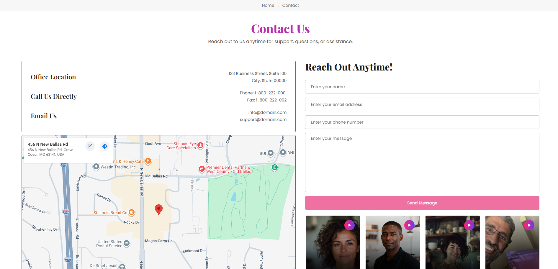
The Contact Form section is designed to help customers easily get in touch with the business. It combines a contact form, business information rows, embedded map, and optional video reels to create a complete contact experience. This section supports business details, map integration, typography customization, form settings, responsive video reels, layout controls, color schemes, and spacing options.
Blocks Configuration
The Information Row block displays business contact details such as office address, phone number, support information, or email.
Content:
| Setting |
Description |
| Heading |
Defines the title displayed for the information row. |
| Description |
Displays business details such as address, phone number, or email information. |
Heading Typography:
| Setting |
Description |
| Heading Size |
Controls the size of the information row heading. |
| Heading Weight |
Adjusts the font thickness of the heading text. |
| Heading Case |
Changes the text transformation style such as uppercase, lowercase, capitalize, or default. |
| Heading Tag |
Sets the HTML heading tag level from H1 to H6 for SEO and accessibility purposes. |
| Heading Font Family |
Allows switching between default and body font family styles. |
| Heading Color Style |
Applies predefined color styling to the heading text. |
| Heading Link Style |
Controls styling behavior of links inside heading content. |
| Enable Heading Gradient |
Enables gradient styling for the heading text. |
Description Typography:
| Setting |
Description |
| Description Size |
Controls the size of the description text. |
| Description Weight |
Adjusts the font thickness of the description text. |
| Description Case |
Changes the text transformation style for description text. |
| Description Font Family |
Allows switching between default and heading font family styles. |
| Description Color Style |
Applies predefined color styling to description text. |
Video Block:
The Video block displays short videos or reels inside the contact section.
Video Settings:
| Setting |
Description |
| Shopify Hosted Video |
Uploads a video directly to Shopify. |
| Cover Image |
Uploads a thumbnail image shown before the video plays. |
| Caption |
Displays short supporting text below the video. |
Video Typography:
| Setting |
Description |
| Caption Weight |
Controls the font thickness of the video caption text. |
| Caption Case |
Changes the text transformation style such as uppercase, lowercase, capitalize, or default. |
| Caption Font Family |
Allows switching between default and heading font family styles. |
Styling:
| Setting |
Description |
| Background Overlay |
Controls the background overlay styling shown behind video captions. |
| Text Color |
Controls the caption text color displayed over videos. |
Section Configuration
Breadcrumb:
| Setting |
Description |
| Show Breadcrumb |
Displays breadcrumb navigation above the contact page. |
| Breadcrumb Color Scheme |
Applies a predefined color palette to the breadcrumb section. |
| Map Setting |
Description |
| Map Embed Iframe |
Adds a Google Maps or custom embedded map iframe for business location display. |
| Setting |
Description |
| Form Heading |
Defines the heading displayed above the contact form. |
| Form Heading Size |
Controls the size of the form heading text. |
| Form Heading Weight |
Adjusts the font thickness of the form heading text. |
| Form Heading Case |
Changes the text transformation style for form heading text. |
| Form Heading Tag |
Sets the HTML heading tag level from H1 to H6. |
| Form Heading Font Family |
Allows switching between default and body font family styles. |
| Form Heading Color Style |
Applies predefined color styling to form heading text. |
| Form Heading Link Style |
Controls styling behavior of links inside heading content. |
| Enable Form Heading Gradient |
Enables gradient styling for form heading text. |
| Button Label |
Defines the contact form submit button text. |
| Button Style |
Controls the visual appearance of the form button such as Primary, Secondary, or Link style. |
| Button Case |
Changes the text transformation style for button text. |
Reels Settings
| Setting |
Description |
| Media Ratio |
Controls the video reel ratio such as Adapt, Square, Portrait, Landscape, or Fit to Box. |
| Desktop Reel Height |
Controls reel height on desktop devices when fit mode is enabled. |
| Mobile Reel Height |
Controls reel height on mobile devices when fit mode is enabled. |
| Desktop Grid Spacing |
Adds spacing between video reels on desktop devices. |
| Mobile Grid Spacing |
Adds spacing between video reels on mobile devices. |
| Show Slideshow Arrows |
Displays navigation arrows for reel slideshow. |
| Auto Play Reels |
Automatically rotates reel videos. |
| Play on Hover |
Plays video when users hover over it. |
Preset Configuration
The default preset of the Contact Form section includes:
- 3 Information Row blocks (office, phone, email)
- 4 Video reel blocks
- Embedded Google Map support
- Contact form with CTA button
- Ready-to-use contact page structure
