Multicolumn
Overview:
The Multicolumn section is designed to showcase step-by-step processes, product highlights, features, benefits, or categorized content in a structured multi-column layout. It supports tabsets, step-based columns, images, captions, buttons, slideshow functionality, responsive grid layouts, typography customization, and multiple step view styles. This section helps merchants organize content in a clean, visual, and easy-to-understand format.
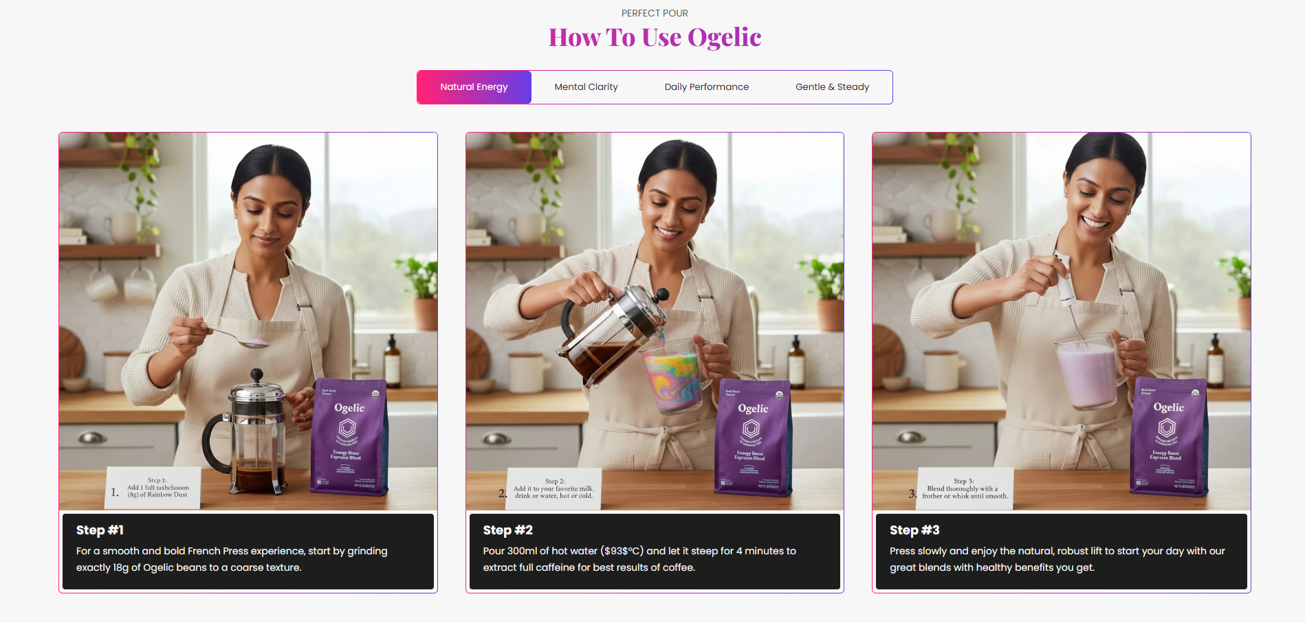
Blocks Configuration
Step Column Block:
The Step Column block displays individual content items such as steps, features, or product highlights.
Content:
| Setting |
Description |
| Tabset Index |
Assigns the column item to a specific tabset group. |
| Step Image |
Uploads an image displayed for the step or feature. |
| Step Count |
Displays a step number used in step layout styles. Available only in Step View Two. |
| Heading |
Defines the title displayed for the step or feature item. |
| Description |
Displays supporting text or additional details below the heading. |
Tabset Block:
The Tabset block creates tab navigation used to group related step columns.
| Setting |
Description |
| Tabset Label |
Defines the title displayed for the tab navigation item. |
Section Configuration
Caption:
| Setting |
Description |
| Section Caption |
Displays a small introductory caption above the section heading. |
| Caption Size |
Controls the size of the caption text. |
| Caption Weight |
Adjusts the font thickness of the caption text. |
| Caption Case |
Changes the text transformation style such as uppercase, lowercase, capitalize, or default. |
| Caption Font Family |
Allows switching between default and heading font family styles. |
Heading:
| Setting |
Description |
| Section Heading |
Defines the main heading displayed inside the section. |
| Heading Size |
Controls the size of the heading text. |
| Heading Weight |
Adjusts the font thickness of the heading text. |
| Heading Case |
Changes the text transformation style such as uppercase, lowercase, capitalize, or default. |
| Heading Tag |
Sets the HTML heading tag level from H1 to H6 for SEO and accessibility purposes. |
| Heading Font Family |
Allows switching between default and body font family styles. |
| Heading Color Style |
Applies predefined color styling to the heading text. |
| Enable Heading Gradient |
Enables gradient styling for section headings. |
| Setting |
Description |
| Button Label |
Defines the text displayed on the section button. |
| Button Link |
Adds a URL link to the button. |
| Button Style |
Controls the visual appearance such as Primary, Secondary, or Link style. |
| Button Case |
Changes the text transformation style for button text. |
| Open in New Tab |
Opens the button link in a new browser tab when enabled. |
Column Settings:
| Setting |
Description |
| Media Ratio |
Controls the image ratio such as Adapt, Square, Portrait, Landscape, or Fit to Box. |
| Desktop Media Height |
Controls media height on desktop devices when fit mode is enabled. |
| Mobile Media Height |
Controls media height on mobile devices when fit mode is enabled. |
Column Heading Typography:
| Setting |
Description |
| Column Heading Size |
Controls the size of step headings. |
| Column Heading Weight |
Adjusts the font thickness of step headings. |
| Column Heading Case |
Changes the text transformation style for step headings. |
| Column Heading Tag |
Sets the HTML heading tag level from H1 to H6. |
| Column Heading Font Family |
Allows switching between default and body font family styles. |
| Enable Column Heading Gradient |
Enables gradient styling for column headings. |
Column Description Typography:
| Setting |
Description |
| Column Description Size |
Controls the size of column description text. |
| Column Description Weight |
Adjusts the font thickness of column description text. |
| Column Description Case |
Changes the text transformation style for description text. |
| Column Description Font Family |
Allows switching between default and heading font family styles. |
| Column Description Color Style |
Applies predefined color styling to description text. |
Column Alignment
| Setting |
Description |
| Text Alignment (Desktop) |
Sets the horizontal alignment of column content on desktop devices. |
| Text Alignment (Mobile) |
Sets the horizontal alignment of column content on mobile devices. |
Grid Settings:
| Setting |
Description |
| Desktop Columns |
Controls the number of columns displayed on desktop devices. |
| Mobile Columns |
Controls whether 1 or 2 columns appear on mobile devices. |
| Desktop Grid Spacing |
Adds spacing between columns on desktop devices. |
| Mobile Grid Spacing |
Adds spacing between columns on mobile devices. |
Slideshow Settings:
| Setting |
Description |
| Show Slideshow Arrows |
Displays navigation arrows for the slideshow layout. |
| Enable Auto Play |
Automatically rotates content slides. |
| Slideshow Interval |
Controls the autoplay delay timing between slides. |
Layout:
| Setting |
Description |
| Step Layout |
Controls the visual style of the section using Step View One, Step View Two, or Step View Three. |
| Number Count Position |
Controls the step number position such as Left, Center, or Right. Available in Step View Two and Step View Three. |
| Count Text Color |
Controls the step number text color. |
| Count Background Color |
Controls the step number background color. |
| Container Layout |
Determines whether the section uses a Contained, Contained Content, or Full Width layout. |
| Container Width |
Controls the maximum width of the section container on desktop devices. |
| Text Alignment (Desktop) |
Sets the horizontal alignment of section content on desktop devices. |
| Text Alignment (Mobile) |
Sets the horizontal alignment of section content on mobile devices. |
