Image banner
Overview:
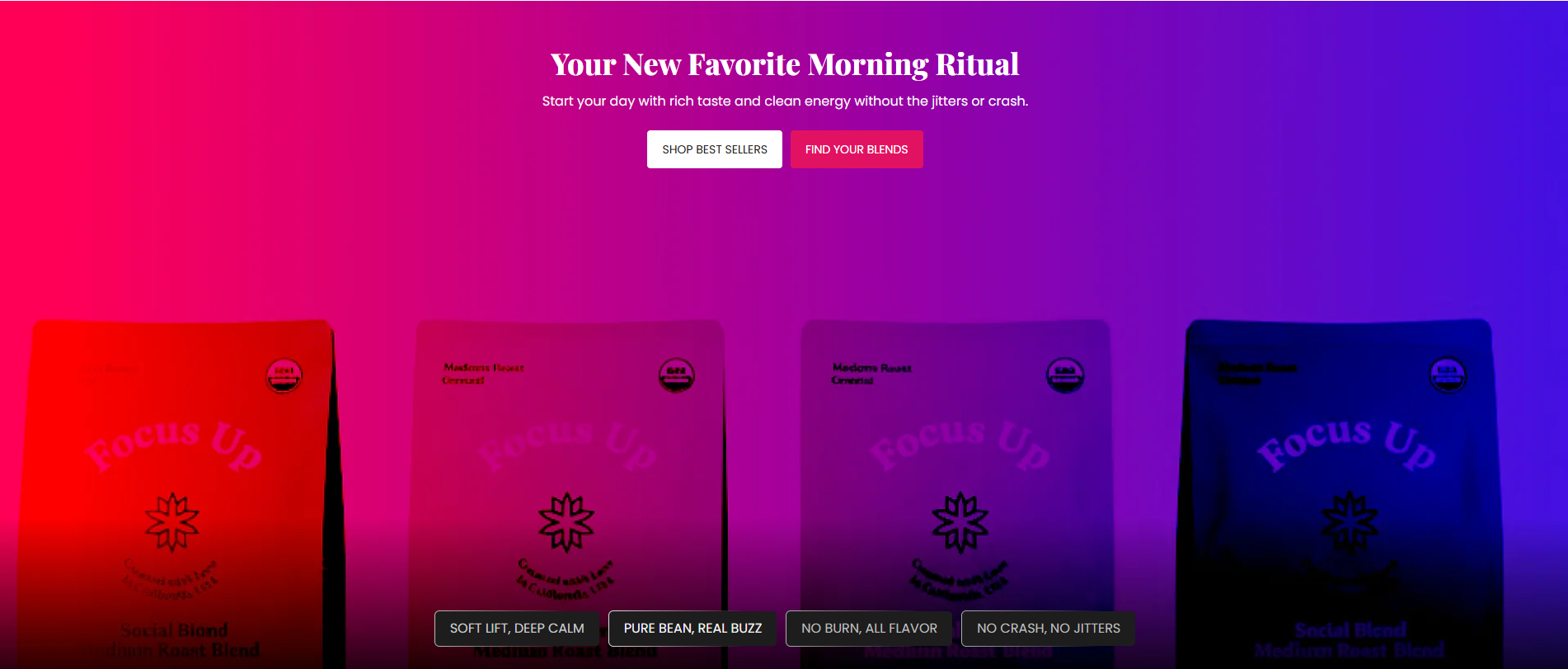
The Image Banner section is designed to create visually engaging hero banners using background images, promotional content, review bars, badges, and call-to-action buttons. It supports desktop/mobile background images, overlays, typography customization, review badges, responsive content positioning, and spacing controls. This section is ideal for homepage hero banners, promotions, brand storytelling, product launches, or conversion-focused messaging.
Blocks Configuration
Heading Block:
The Heading block displays the primary banner heading.
| Setting |
Description |
| Heading Text |
Defines the main heading displayed inside the image banner. |
| Heading Size |
Controls the size of the heading text. |
| Heading Weight |
Adjusts the font thickness of the heading text. |
| Heading Case |
Changes the text transformation style such as uppercase, lowercase, capitalize, or default. |
| Heading Tag |
Sets the HTML heading tag level from H1 to H6 for SEO and accessibility purposes. |
| Heading Font Family |
Allows switching between default and body font family styles. |
| Heading Color Style |
Applies predefined color styling to the heading text. |
| Heading Link Style |
Controls styling behavior of links inside heading content. |
| Enable Heading Gradient |
Enables gradient styling for heading text. |
| Bottom Margin (Desktop) |
Adds spacing below the heading block on desktop devices. |
| Bottom Margin (Mobile) |
Adds spacing below the heading block on mobile devices. |
Description Block:
The Description block displays supporting text below the heading.
| Setting |
Description |
| Description Content |
Displays promotional text, product information, or supporting content. |
| Description Size |
Controls the size of description text. |
| Description Weight |
Adjusts the font thickness of description text. |
| Description Case |
Changes the text transformation style for description text. |
| Description Font Family |
Allows switching between default and heading font family styles. |
Reviews Bar Block:
The Reviews Bar block displays trust indicators, ratings, and credibility messaging.
| Setting |
Description |
| Rating Value |
Displays the review score such as 5 Stars. |
| Review Text |
Defines supporting review content displayed beside the rating. |
| Text Size |
Controls the size of review bar text. |
| Text Weight |
Adjusts the font thickness of review bar text. |
| Text Case |
Changes the text transformation style for review text. |
| Font Family |
Allows switching between default and heading font family styles. |
| Background Style |
Controls the review bar background color or gradient. |
| Text Color |
Controls the review bar text color. |
The Button block displays call-to-action buttons inside the banner.
| Setting |
Description |
| Button Label |
Defines the text displayed on the button. |
| Button Link |
Adds a URL link to the button. |
| Button Style |
Controls the button appearance such as Primary, Secondary, or Link style. |
| Button Case |
Changes the text transformation style for button text. |
| Open in New Tab |
Opens the button link in a new browser tab when enabled. |
| Bottom Margin (Desktop) |
Adds spacing below the button. |
| Bottom Margin (Mobile) |
Adds spacing below the button. |
Badge Block:
The Badge block displays compact promotional labels or highlights.
| Setting |
Description |
| Badge Label |
Defines the text displayed inside the badge. |
Section Configuration
Background Images:
| Setting |
Description |
| Desktop Image |
Uploads the main image displayed on desktop devices. |
| Desktop Overlay |
Adds a gradient or overlay effect on the desktop image. |
| Mobile Image |
Uploads a separate image displayed on mobile devices. |
| Mobile Overlay |
Adds a gradient or overlay effect on the mobile image. |
Badge Settings:
| Setting |
Description |
| Enable Next Animation |
Enables animated transitions between badges. |
| Badge Text Size |
Controls the size of badge text. |
| Badge Text Weight |
Adjusts the font thickness of badge text. |
| Badge Text Case |
Changes the text transformation style for badge text. |
| Badge Font Family |
Allows switching between default and heading font family styles. |
Grid Settings:
| Setting |
Description |
| Desktop Grid Spacing |
Adds spacing between badges or content on desktop devices. |
| Mobile Grid Spacing |
Adds spacing between badges or content on mobile devices. |
Layout:
| Setting |
Description |
| Desktop Height |
Controls the banner height such as Small, Medium, Large, or Full Height. |
| Mobile Height |
Controls the banner height on mobile devices. |
| Content Position |
Controls whether content appears first or second inside the banner layout. |
| Content Alignment (Desktop) |
Aligns content to Top, Middle, or Bottom on desktop devices. |
| Content Alignment (Mobile) |
Aligns content to Top, Middle, or Bottom on mobile devices. |
| Container Layout |
Determines whether the section uses a Contained, Contained Content, or Full Width layout. |
| Container Width |
Controls the maximum width of the container on desktop devices. |
| Text Alignment (Desktop) |
Sets content alignment on desktop devices. |
| Text Alignment (Mobile) |
Sets content alignment on mobile devices. |
Preset Configuration
The default preset of the Image Banner section includes:
- 1 Heading block
- 1 Description block
- 1 Reviews Bar block
- 2 Button blocks (Primary + Secondary)
- 4 Badge blocks
- Background image support for desktop and mobile
- Ready-to-use hero banner layout
