Featured product
Overview:
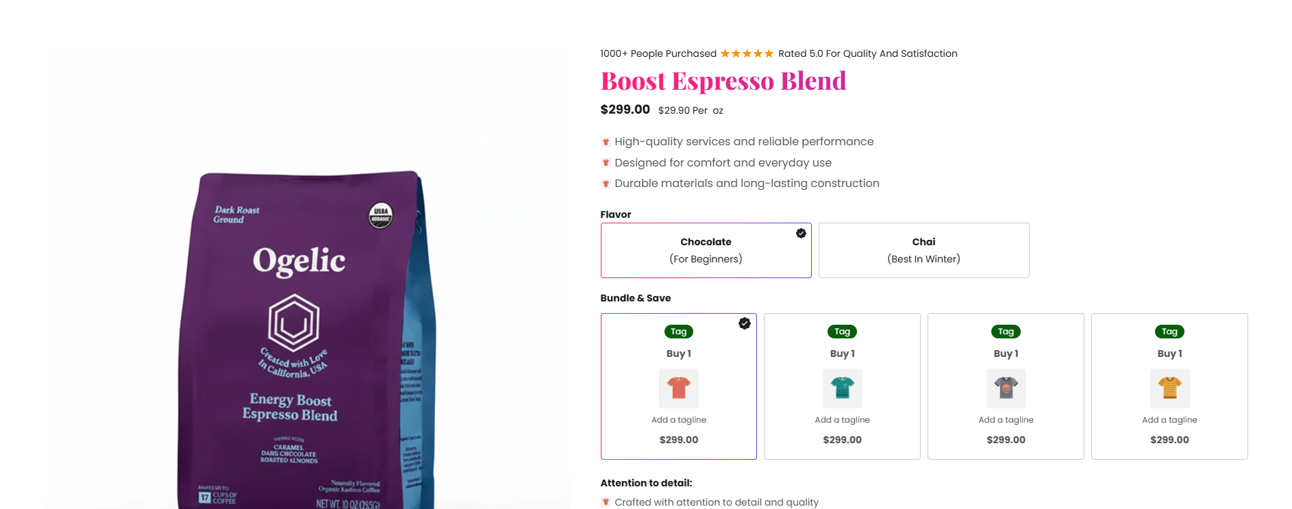
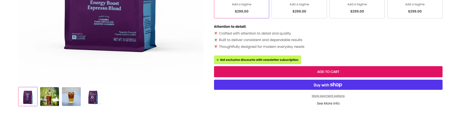
The Featured Product section is designed to showcase a product in detail with advanced merchandising and conversion-focused components. It supports product addons, bundle packs, pickup availability, point lists, information tabs, custom liquid content, sharing options, app integrations, and separators. This section helps merchants create a highly optimized product page experience with upsells, product information, trust-building content, and customizable layouts.
Blocks Configuration
App Block:
The App block allows third-party Shopify apps to inject dynamic content into the featured product section.
| Setting |
Description |
| App Embed |
Displays dynamic app content such as subscriptions, reviews, upsells, or third-party widgets. |
Custom Liquid Block:
The Custom Liquid block allows merchants to insert custom Liquid, HTML, or Shopify dynamic objects.
| Setting |
Description |
| Custom Liquid |
Allows adding custom Liquid code, embeds, widgets, metafields, or custom storefront logic. |
Column Separator Block:
The Column Separator block adds a visual divider between content columns inside the product layout.
| Setting |
Description |
| Separator |
Displays a column-based visual separator for structured content organization. |
Full Width Separator Block:
The Full Width Separator block adds a full-width divider inside the featured product section.
| Setting |
Description |
| Separator |
Displays a page-width divider between product content areas. |
Product Addons Block:
The Product Addons block allows merchants to offer additional products as upsells.
Product Selection
| Setting |
Description |
| Product Addons |
Selects up to 10 products that customers can add alongside the main product. |
| Setting |
Description |
| Heading |
Defines the heading displayed above product addons. |
| Heading Size |
Controls the size of the heading text. |
| Heading Weight |
Adjusts the font thickness of the heading text. |
| Heading Case |
Changes text transformation such as uppercase, lowercase, capitalize, or default. |
| Heading Font Family |
Allows switching between default and body font family styles. |
| Heading Color Style |
Applies predefined color styling to the heading text. |
| Enable Heading Gradient |
Enables gradient styling for the heading text. |
Price Settings:
| Setting |
Description |
| Show Unit Price |
Displays unit pricing information for addon products. |
| Price Layout |
Controls whether to show only price or price + compare-at price. |
See More Info Block:
The See More Info block displays expandable informational text or trigger labels.
| Setting |
Description |
| Text |
Defines the text displayed such as See More Info. |
| Text Size |
Controls text size. |
| Text Weight |
Adjusts font thickness. |
| Text Case |
Changes text transformation style. |
| Text Font Family |
Allows switching between default and heading font family styles. |
The Tags block displays Shopify product tags associated with the featured product.
Spacing
| Setting |
Description |
| Bottom Margin (Desktop) |
Adds spacing below product tags. |
| Bottom Margin (Mobile) |
Adds spacing below product tags. |
Bundle Packs Block:
The Bundle Packs block allows merchants to create quantity-based offers and bundled product deals. Supports up to 4 bundle cards with discount logic and optional addon products.
| Setting |
Description |
| Heading |
Defines the bundle section heading such as Bundle & Save. |
| Heading Size |
Controls heading size. |
| Heading Weight |
Adjusts font thickness. |
| Heading Case |
Changes heading text transformation style. |
| Heading Font Family |
Allows switching between default and body font family styles. |
| Heading Color Style |
Applies predefined heading color styling. |
| Enable Heading Gradient |
Enables heading gradient effect. |
Bundle Card Settings (Applies to All Bundle Cards):
| Setting |
Description |
| Bundle Image |
Uploads an image displayed for the bundle pack. |
| Plan Title |
Displays plan title for supported layout styles. |
| Plan Title Background |
Controls title background color. |
| Plan Title Text Color |
Controls title text color. |
| Bundle Heading |
Defines bundle title such as Buy 2 / Buy 3. |
| Tagline |
Displays supporting text under bundle title. |
| Tag |
Displays promotional labels such as Best Seller or Save More. |
| Tag Background |
Controls tag background color. |
| Tag Text Color |
Controls tag text color. |
| Quantity |
Defines quantity included in the bundle. |
| Percentage Off |
Displays bundle discount percentage. |
| Addon Product |
Adds optional bundled products. |
| Addon Label |
Defines addon product label for supported layouts. |
| Popular Label |
Displays highlighted text such as Most Popular. |
Card Typography:
| Setting |
Description |
| Card Title Size |
Controls bundle card title size. |
| Card Title Weight |
Adjusts title thickness. |
| Card Title Case |
Changes title text transformation style. |
| Card Title Font Family |
Allows font switching. |
| Card Heading Size |
Controls heading size. |
| Card Heading Weight |
Adjusts heading thickness. |
| Card Heading Case |
Changes heading case. |
| Card Heading Font Family |
Allows font switching. |
| Card Heading Color Style |
Applies predefined heading styling. |
| Enable Heading Gradient |
Enables gradient styling for card headings. |
Tagline Typography:
| Setting |
Description |
| Tagline Size |
Controls tagline size. |
| Tagline Weight |
Adjusts tagline thickness. |
| Tagline Case |
Changes text transformation style. |
| Tagline Font Family |
Allows font switching. |
Price Typography:
| Setting |
Description |
| Price Size |
Controls price size. |
| Price Weight |
Adjusts price thickness. |
| Price Case |
Changes text transformation style. |
| Price Font Family |
Allows font switching. |
Savings Tag:
| Setting |
Description |
| Show Savings Tag |
Displays savings badge. |
| Savings Tag Size |
Controls savings badge text size. |
| Savings Tag Weight |
Adjusts text thickness. |
| Savings Tag Case |
Changes text transformation style. |
| Savings Tag Font Family |
Allows font switching. |
| Savings Tag Background |
Controls savings tag background color. |
| Savings Tag Text Color |
Controls savings tag text color. |
Popular Tag Settings:
| Setting |
Description |
| Popular Tag Case |
Changes featured tag text transformation style. |
| Popular Tag Background |
Controls background color. |
| Popular Tag Text Color |
Controls text color. |
Layout Settings:
| Setting |
Description |
| Layout Style |
Select from 8 predefined bundle layout styles. |
| Price Layout Style |
Controls price display style such as None, Price, or Price + Unit Price. |
| Show Savings |
Displays savings amount or percentage. |
| Show Tagline |
Enables bundle taglines. |
| Show Tag |
Displays promotional tags. |
Grid Settings:
| Setting |
Description |
| Desktop Columns |
Controls number of columns shown on desktop (1–4). |
| Mobile Columns |
Controls mobile column count (1 or 2). |
| Desktop Grid Spacing |
Adds spacing between bundle cards on desktop. |
| Mobile Grid Spacing |
Adds spacing between bundle cards on mobile. |
Content Block:
The Content block displays additional product-related content or dynamic information.
Spacing
| Setting |
Description |
| Bottom Margin (Desktop) |
Adds spacing below content block. |
| Bottom Margin (Mobile) |
Adds spacing below content block. |
Share Block:
The Share block allows customers to share the product.
| Setting |
Description |
| Share Buttons |
Displays product sharing options for supported platforms. |
Pickup Block:
The Pickup block displays store pickup availability and pickup drawer settings.
Pickup Typography:
| Setting |
Description |
| Text Size |
Controls pickup text size. |
| Text Weight |
Adjusts pickup text thickness. |
| Text Case |
Changes text transformation style. |
| Text Font Family |
Allows switching between default and heading font family styles. |
| Text Color Style |
Applies predefined text styling. |
Pickup Drawer Settings:
| Setting |
Description |
| Drawer Heading Size |
Controls pickup drawer heading size. |
| Drawer Heading Weight |
Adjusts heading thickness. |
| Drawer Heading Case |
Changes heading text transformation style. |
| Drawer Heading Font Family |
Allows font switching. |
| Drawer Heading Color Style |
Applies predefined heading styling. |
| Enable Heading Gradient |
Enables heading gradient. |
| Drawer Color Scheme |
Applies a predefined color scheme to the pickup drawer. |
Point Item Block:
The Point Item block displays feature highlights, benefits, or trust points.
| Setting |
Description |
| Icon Image |
Uploads an icon image displayed beside the text. |
| Icon Size |
Controls icon size. |
| Text |
Defines point content such as product benefits or features. |
| Text Size |
Controls text size. |
| Text Weight |
Adjusts font thickness. |
| Text Case |
Changes text transformation style. |
| Text Font Family |
Allows font switching. |
| Text Color Style |
Applies predefined styling. |
Tab List Block:
The Tab List block creates expandable informational tabs for product details, shipping, FAQs, ingredients, or policies.
| Setting |
Description |
| Icon Image |
Uploads an icon displayed beside tab title. |
| Icon Size |
Controls icon size. |
| Heading |
Defines tab heading. |
| Heading Size |
Controls heading size. |
| Heading Weight |
Adjusts heading thickness. |
| Heading Case |
Changes heading text transformation style. |
| Heading Font Family |
Allows font switching. |
| Heading Color Style |
Applies predefined heading styling. |
| Description |
Displays detailed rich text content inside tabs. |
