Featured collection
Overview:
The Featured Collection section is designed to showcase selected product collections in a visually engaging and conversion-focused layout. It supports collection selection, captions, headings, descriptions, call-to-action buttons, grid or slideshow layouts, review bars, product cards, quick view, add-to-cart, trust indicators, and responsive styling. This section helps merchants highlight best-selling, featured, seasonal, or promotional products from a selected collection.
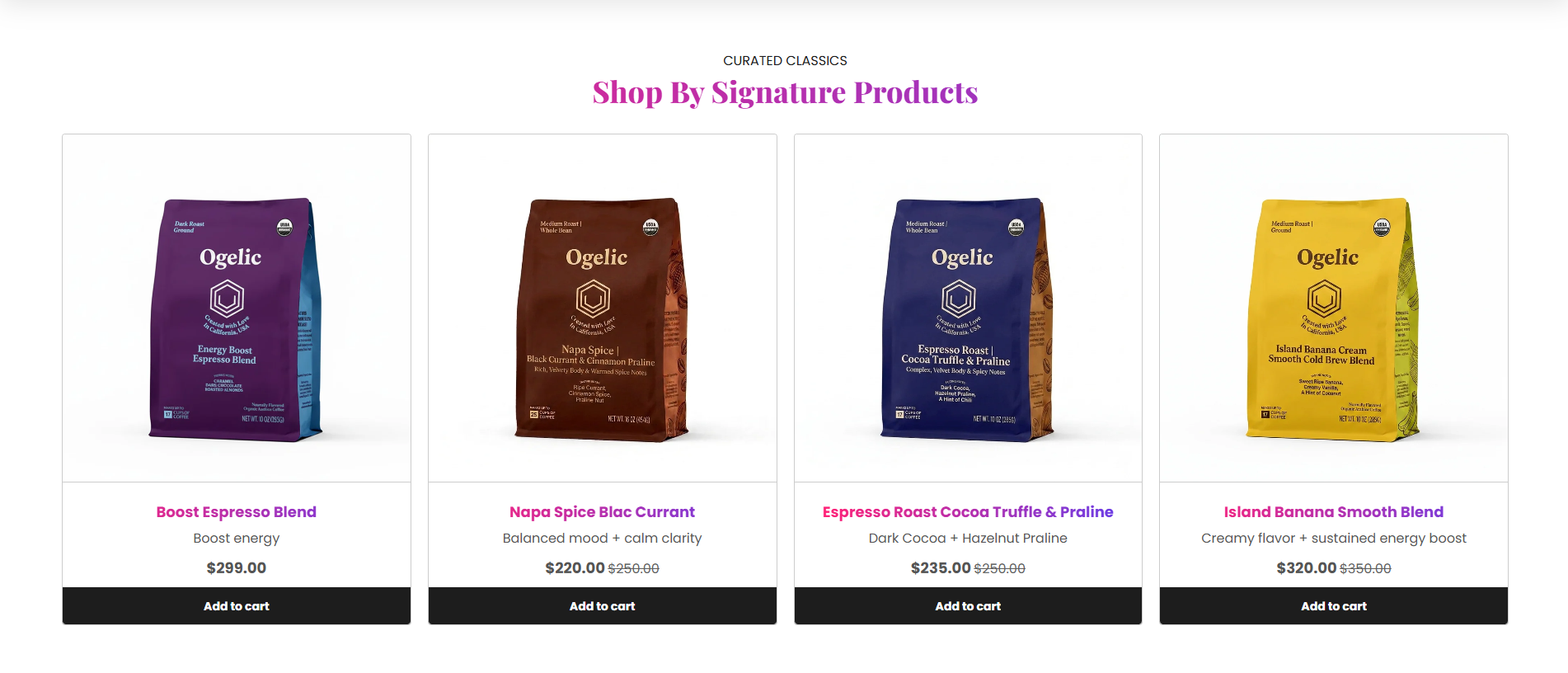
Section Configuration
Collection Settings:
| Setting |
Description |
| Collection |
Selects the Shopify collection displayed inside the section. |
Caption:
| Setting |
Description |
| Section Caption |
Displays a small introductory caption above the section heading. |
| Caption Size |
Controls the size of the caption text. |
| Caption Weight |
Adjusts the font thickness of the caption text. |
| Caption Case |
Changes the text transformation style such as Uppercase, Lowercase, Capitalize, or Default. |
| Setting |
Description |
| Show View All Button |
Displays a View All button for the selected collection. |
| Button Label |
Defines the button text displayed inside the CTA button. |
| Button Style |
Controls the visual appearance such as Primary, Secondary, or Link style. |
| Button Case |
Changes text transformation style for button text. |
| Open in New Tab |
Opens the collection page in a new browser tab when enabled. |
Grid Settings:
| Setting |
Description |
| Desktop Columns |
Controls the number of product cards displayed on desktop devices (2–5 columns). |
| Maximum Products |
Controls how many products are displayed from the selected collection (4–24 products). |
| Mobile Columns |
Controls whether 1 or 2 columns appear on mobile devices. |
| Desktop Grid Spacing |
Adds spacing between product cards on desktop devices. |
| Mobile Grid Spacing |
Adds spacing between product cards on mobile devices. |
Product Card Settings
Product Layout:
| Setting |
Description |
| Product View Layout |
Controls the product card style using 4 predefined layouts (View 1, View 2, View 3, View 4). |
| Setting |
Description |
| Product Media Ratio |
Controls image ratio such as Adapt, Square, Portrait, Landscape, or Fit to Box. |
| Desktop Product Height |
Controls image height on desktop devices when Fit to Box mode is enabled. |
| Mobile Product Height |
Controls image height on mobile devices when Fit to Box mode is enabled. |
Product Alignment:
| Setting |
Description |
| Card Text Alignment (Desktop) |
Sets text alignment inside product cards on desktop devices. |
| Card Text Alignment (Mobile) |
Sets text alignment inside product cards on mobile devices. |
Product Features:
| Setting |
Description |
| Enable Reviews |
Displays product review bar inside supported layouts (View 2 & View 4 only). |
| Enable Add to Cart |
Displays an Add to Cart button on product cards. |
| Enable Quick View |
Displays quick view functionality for products. |
| Show Price |
Displays product pricing. |
| Show Discount Tag |
Displays discount/sale percentage badges. |
| Show Unit Price |
Displays product unit pricing. |
| Show Vendor |
Displays product vendor name. |
| Show Stock Tag |
Displays stock availability indicators. |
| Show Sale Tag |
Displays sale badges. |
| Show Custom Tag |
Displays custom product tags. |
| Show Custom Features |
Displays additional custom feature lists from metafields or settings. |
Review Bar Settings
These settings are available when Enable Reviews is enabled.
Review Content:
| Setting |
Description |
| Profile Icon |
Uploads a profile/customer icon for review display. |
| Trust Icon |
Uploads a trust badge icon for credibility messaging. |
| Rating Value |
Displays the rating score such as 5.0. |
| Rating Color |
Controls star or rating icon color. |
| Review Text |
Defines review content with placeholders for stars, counts, and trust icons. |
Split Review Layout:
| Setting |
Description |
| Enable Split Review |
Displays split trust/review cards. |
| Left Review Text |
Defines left-side review messaging. |
| Left Background Color |
Controls left review background color. |
| Left Text Color |
Controls left review text color. |
| Left Border Color |
Controls left review border color. |
| Right Review Text |
Defines right-side trust messaging. |
| Right Background Color |
Controls right review background color. |
| Right Text Color |
Controls right review text color. |
| Right Border Color |
Controls right review border color. |
| Separator Color |
Controls divider color between split review cards. |
Slideshow Settings:
These settings are available when Slideshow Layout is enabled.
| Setting |
Description |
| Show Slideshow Arrows |
Displays navigation arrows for product slides. |
| Show Progress Bar |
Displays slideshow progress indicator. |
| Enable Auto Play |
Automatically rotates collection products. |
| Slideshow Interval |
Controls autoplay delay timing between slides. |
Layout:
| Setting |
Description |
| Section Layout Style |
Controls whether products display in Grid or Slideshow layout. |
| Container Layout |
Determines whether the section uses Contained, Contained Content, or Full Width layout. |
| Container Width |
Controls the maximum width of the section container on desktop devices. |
| Text Alignment (Desktop) |
Sets section text alignment on desktop devices. |
| Text Alignment (Mobile) |
Sets section text alignment on mobile devices. |
Color Scheme:
| Setting |
Description |
| Section Color Scheme |
Applies a predefined color palette to the featured collection section. |
| Inverse Color Scheme |
Inverts selected color scheme styling for contrast variations. |
| Gradient Mode |
Enables gradient styling for Section, Widget, or Both. |
| Enable Heading Gradient |
Enables gradient styling for section headings. |
Preset Configuration:
The default preset of the Featured Collection section includes:
- Selected Shopify Collection support
- Caption, heading, and description area
- View All CTA button
- Grid and slideshow layouts
- 4 product card layouts
- Review bar support
- Quick View & Add to Cart support
- Responsive grid controls
