Product page
Overview
The Main Product section is the core product detail page used to display product information, media galleries, pricing, purchase options, bundle offers, pickup availability, tabs, icons, custom content, and conversion-focused product blocks. It supports highly customizable layouts, typography controls, spacing options, add-ons, product bundles, trust elements, and advanced merchandising features to improve the shopping experience and increase conversions.
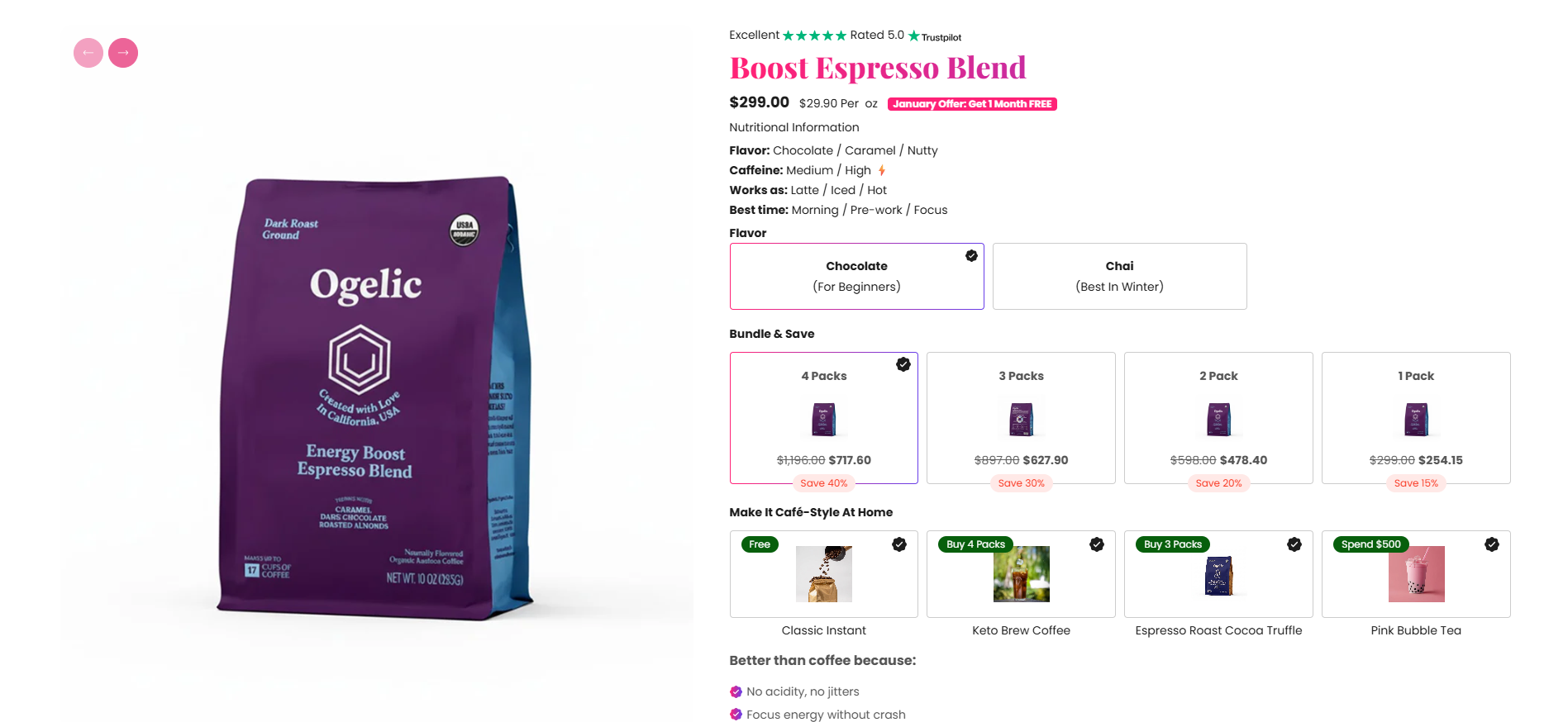
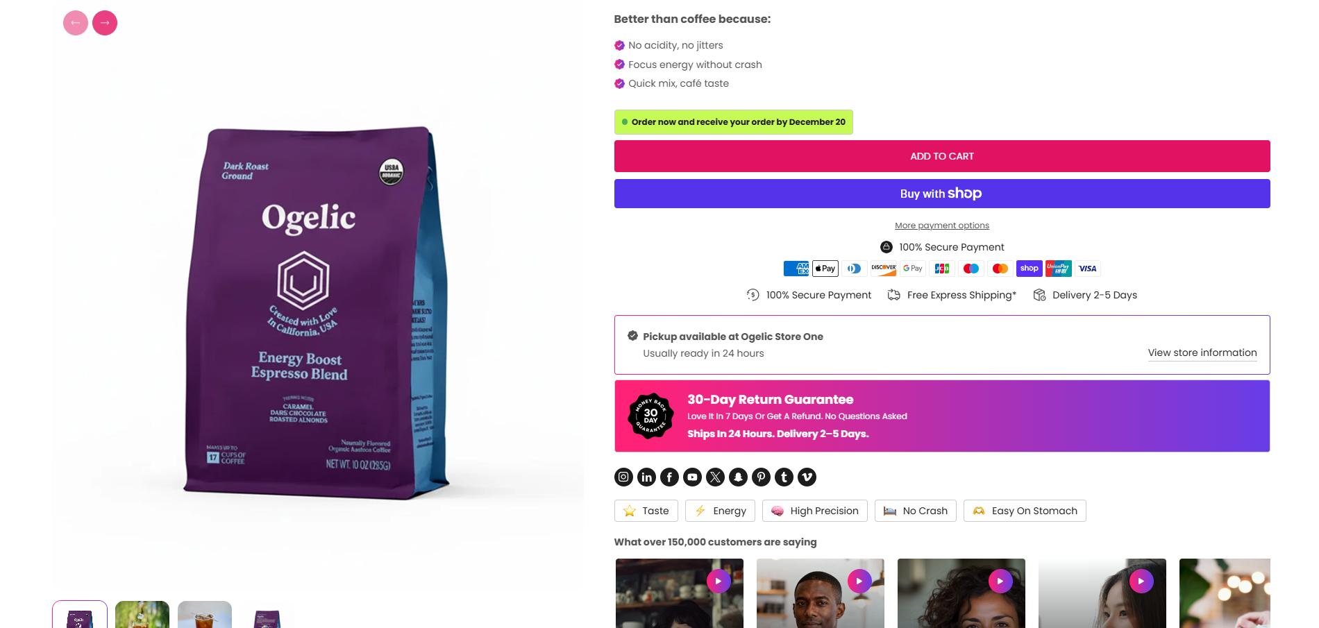
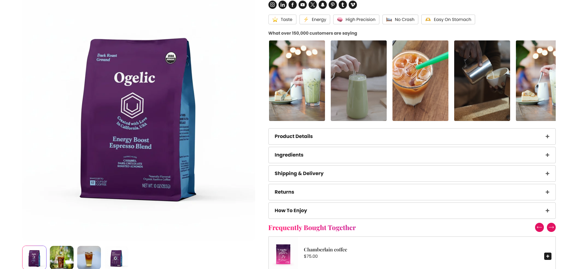
Blocks Configuration
Custom Liquid Block:
The Custom Liquid block allows merchants to add custom Liquid code directly inside the product page for advanced customizations and dynamic content rendering.
| Setting |
Description |
| Custom Liquid |
Adds custom Liquid code, HTML, or dynamic Shopify objects inside the product page. |
Column Separator Block:
The Column Separator block visually separates product content into structured sections.
| Setting |
Description |
| Separator Info |
Displays a visual separator between grouped product content areas. |
Full Width Separator Block:
The Full Width Separator block creates a full-width divider across the product layout.
| Setting |
Description |
| Separator Info |
Displays a full-width separator between product content sections. |
Product Addons Block
The Product Addons block allows merchants to upsell additional products directly on the product page.
Product Settings:
| Setting |
Description |
| Product Addons |
Selects additional products displayed as upsell addons. |
Heading Settings:
| Setting |
Description |
| Heading |
Defines the addon section heading text. |
| Heading Size |
Controls the size of the addon heading text. |
| Heading Weight |
Adjusts the font thickness of the addon heading text. |
| Heading Case |
Changes the text transformation style such as uppercase, lowercase, capitalize, or default. |
| Heading Font Family |
Allows switching between default and body font family styles. |
| Heading Color Style |
Applies predefined color styling to the addon heading text. |
| Enable Heading Gradient |
Enables gradient styling for addon headings. |
Price Settings:
| Setting |
Description |
| Show Unit Price |
Displays unit pricing information for addon products. |
| Price Layout |
Controls whether only price or price with compare-at-price is displayed. |
Spacing:
| Setting |
Description |
| Bottom Spacing (Desktop) |
Adds spacing below the addon block on desktop devices. |
| Bottom Spacing (Mobile) |
Adds spacing below the addon block on mobile devices. |
The Tags block displays product-related labels or tags on the product page.
| Setting |
Description |
| Bottom Spacing (Desktop) |
Adds spacing below the tags block on desktop devices. |
| Bottom Spacing (Mobile) |
Adds spacing below the tags block on mobile devices. |
Bundle Packs Block
The Bundle Packs block allows merchants to create quantity-based bundle offers with discounts, promotional labels, and product add-ons to increase average order value. Multiple bundle cards can be configured with different quantities and promotional styles.
Bundle Content:
| Setting |
Description |
| Heading |
Defines the main bundle section heading text. |
| Heading Size |
Controls the size of the bundle heading. |
| Heading Weight |
Adjusts the font thickness of the bundle heading. |
| Heading Case |
Changes the text transformation style for the bundle heading. |
| Heading Font Family |
Allows switching between default and body font family styles. |
| Heading Color Style |
Applies predefined color styling to the bundle heading. |
| Enable Heading Gradient |
Enables gradient styling for the bundle heading. |
Bundle Card Settings:
Plan Content
| Setting |
Description |
| Bundle Image |
Uploads a product or plan image for the bundle card. |
| Plan Title |
Defines the title displayed for the bundle plan. |
| Plan Title Background |
Controls the background color of the plan title area. |
| Plan Title Text Color |
Controls the text color of the plan title. |
| Bundle Heading |
Defines the main bundle offer heading. |
| Tagline |
Displays supporting promotional text below the bundle heading. |
| Promotional Tag |
Displays promotional labels such as Best Seller or Save More. |
| Tag Background Color |
Controls the promotional tag background color. |
| Tag Text Color |
Controls the promotional tag text color. |
| Quantity |
Defines the quantity included in the bundle pack. |
| Percentage Off |
Adds percentage-based savings information for the bundle. |
| Addon Product |
Selects additional products included with the bundle. |
| Addon Label |
Displays a custom label for addon products. |
| Featured Tag |
Displays a highlighted promotional badge such as Most Popular. |
Typography Settings:
| Setting |
Description |
| Card Title Size |
Controls the size of plan titles. |
| Card Title Weight |
Adjusts the font thickness of plan titles. |
| Card Title Case |
Changes the text transformation style for plan titles. |
| Card Title Font Family |
Allows switching between heading and body font families. |
| Card Heading Size |
Controls the size of bundle headings. |
| Card Heading Weight |
Adjusts the font thickness of bundle headings. |
| Card Heading Case |
Changes the text transformation style for bundle headings. |
| Card Heading Font Family |
Allows switching between default and body font family styles. |
| Card Heading Color Style |
Applies predefined color styling to bundle headings. |
| Enable Heading Gradient |
Enables gradient styling for bundle headings. |
| Tagline Size |
Controls the size of bundle taglines. |
| Tagline Weight |
Adjusts the font thickness of bundle taglines. |
| Tagline Case |
Changes the text transformation style for taglines. |
| Tagline Font Family |
Allows switching between heading and body font families. |
| Price Size |
Controls the size of bundle pricing text. |
| Price Weight |
Adjusts the font thickness of pricing text. |
| Price Case |
Changes the text transformation style for pricing text. |
| Price Font Family |
Allows switching between heading and body font families. |
Savings Tag Settings:
| Setting |
Description |
| Enable Savings Tag |
Displays savings badges on bundle cards. |
| Savings Badge Size |
Controls the size of savings labels. |
| Savings Badge Weight |
Adjusts the font thickness of savings labels. |
| Savings Badge Case |
Changes the text transformation style for savings labels. |
| Savings Badge Font Family |
Allows switching between heading and body font families. |
| Savings Badge Background |
Controls the savings badge background color. |
| Savings Badge Text Color |
Controls the savings badge text color. |
Featured Tag Settings:
| Setting |
Description |
| Featured Tag Case |
Changes the text transformation style for featured tags. |
| Featured Tag Background |
Controls the featured tag background color. |
| Featured Tag Text Color |
Controls the featured tag text color. |
Layout & Grid
| Setting |
Description |
| Layout Style |
Controls the visual design style of bundle cards. |
| Price Layout Style |
Controls how pricing is displayed inside bundle cards. |
| Show Savings |
Displays savings badges inside bundle cards. |
| Show Tagline |
Displays supporting tagline text. |
| Show Tag |
Displays promotional tags on bundle cards. |
| Desktop Columns |
Controls the number of bundle columns displayed on desktop devices. |
| Mobile Columns |
Controls the number of bundle columns displayed on mobile devices. |
| Desktop Grid Spacing |
Adds spacing between bundle cards on desktop devices. |
| Mobile Grid Spacing |
Adds spacing between bundle cards on mobile devices. |
Content Block:
The Content block displays the main product description or custom product content.
| Setting |
Description |
| Bottom Spacing (Desktop) |
Adds spacing below the content block on desktop devices. |
| Bottom Spacing (Mobile) |
Adds spacing below the content block on mobile devices. |
Share Block
The Share block allows customers to share products on social platforms.
| Setting |
Description |
| Share Information |
Displays sharing-related information and share functionality. |
| Bottom Spacing (Desktop) |
Adds spacing below the share block on desktop devices. |
| Bottom Spacing (Mobile) |
Adds spacing below the share block on mobile devices. |
Pickup Availability Block
The Pickup block displays local pickup availability information for products.
Typography:
| Setting |
Description |
| Text Size |
Controls the size of pickup information text. |
| Text Weight |
Adjusts the font thickness of pickup information text. |
| Text Case |
Changes the text transformation style for pickup text. |
| Text Font Family |
Allows switching between default and heading font families. |
| Text Color Style |
Applies predefined color styling to pickup information text. |
Pickup Drawer:
| Setting |
Description |
| Drawer Heading Size |
Controls the size of the pickup drawer heading. |
| Drawer Heading Weight |
Adjusts the font thickness of the pickup drawer heading. |
| Drawer Heading Case |
Changes the text transformation style for pickup drawer headings. |
| Drawer Heading Font Family |
Allows switching between default and body font families. |
| Drawer Heading Color Style |
Applies predefined color styling to pickup drawer headings. |
| Enable Drawer Heading Gradient |
Enables gradient styling for pickup drawer headings. |
| Drawer Color Scheme |
Applies a predefined color palette to the pickup drawer. |
Point Item Block
The Point Item block displays trust points, benefits, or product highlights using icons and text.
| Setting |
Description |
| Icon Image |
Uploads an icon displayed beside the point item text. |
| Icon Size |
Controls the size of the point item icon. |
| Text |
Defines the point item text content. |
| Text Size |
Controls the size of point item text. |
| Text Weight |
Adjusts the font thickness of point item text. |
| Text Case |
Changes the text transformation style for point item text. |
| Text Font Family |
Allows switching between default and heading font families. |
| Text Color Style |
Applies predefined color styling to point item text. |
| Bottom Spacing (Desktop) |
Adds spacing below the point item block on desktop devices. |
| Bottom Spacing (Mobile) |
Adds spacing below the point item block on mobile devices. |
Tab List Block
The Tab List block creates expandable tabs or accordion-style content areas for product information, shipping details, FAQs, and policies.
Content:
| Setting |
Description |
| Icon Image |
Uploads an icon displayed beside the tab heading. |
| Icon Size |
Controls the size of the tab icon. |
| Heading |
Defines the tab heading text. |
| Heading Size |
Controls the size of tab headings. |
| Heading Weight |
Adjusts the font thickness of tab headings. |
| Heading Case |
Changes the text transformation style for tab headings. |
| Heading Font Family |
Allows switching between default and heading font families. |
| Heading Color Style |
Applies predefined color styling to tab headings. |
| Description Content |
Displays detailed tab content or accordion descriptions. |
| Description Size |
Controls the size of description text. |
| Description Weight |
Adjusts the font thickness of description text. |
| Description Case |
Changes the text transformation style for descriptions. |
| Description Font Family |
Allows switching between default and heading font families. |
| Description Color Style |
Applies predefined color styling to description text. |
