Collection page
Overview:
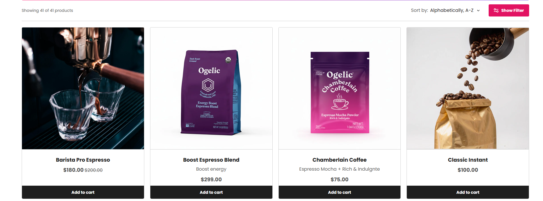
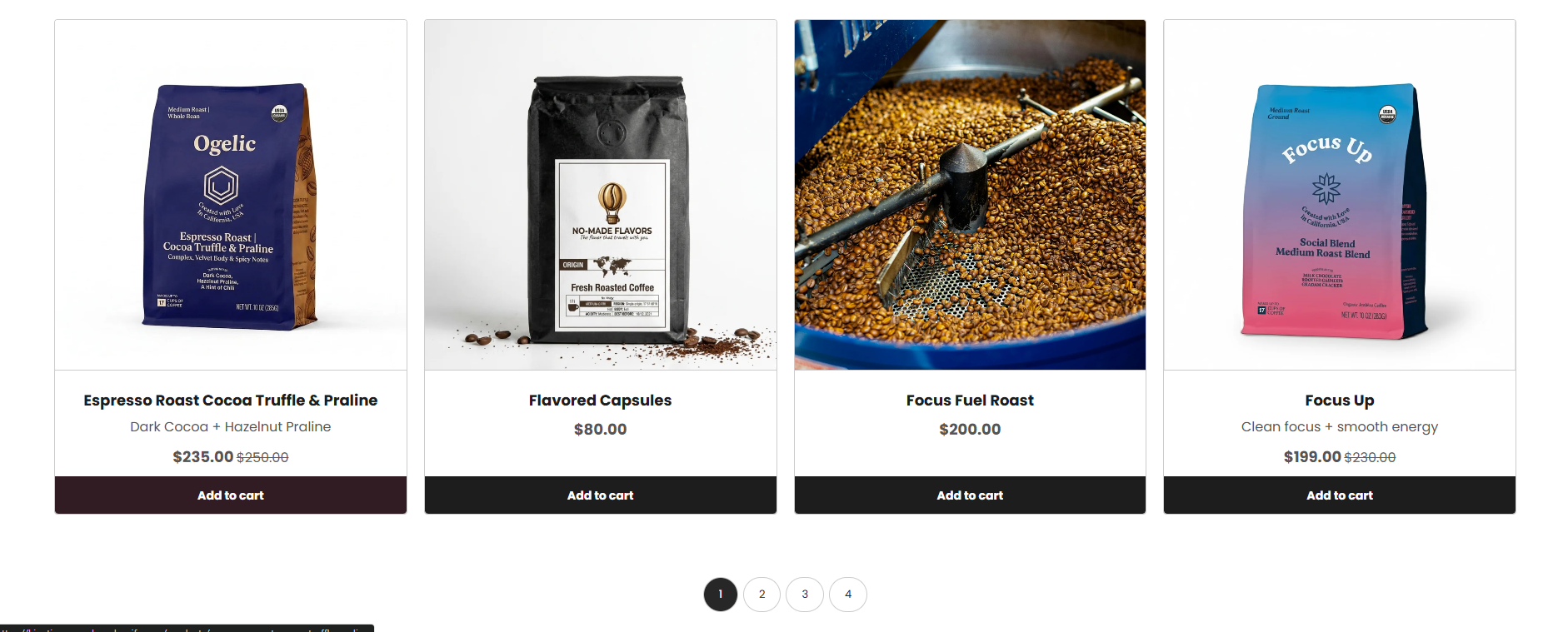
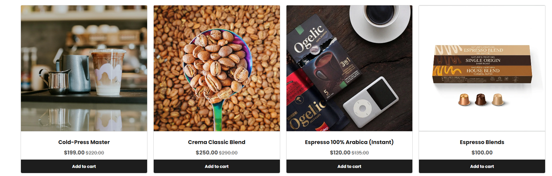
The Main Products Grid section displays collection and product listing pages in a customizable grid layout. It supports collection banners, headings, descriptions, product cards, reviews, filters, sorting, pagination, responsive layouts, typography controls, and advanced product display settings. This section helps merchants create a flexible and conversion-focused collection browsing experience for customers.
Section Configuration
Breadcrumb:
| Setting |
Description |
| Show Breadcrumb |
Displays breadcrumb navigation above the collection page for improved navigation and SEO structure. |
| Breadcrumb Color Scheme |
Applies a predefined color palette to the breadcrumb section. |
Banner:
| Setting |
Description |
| Banner Image |
Uploads a banner image displayed at the top of the collection page. |
| Banner Media Ratio |
Controls the aspect ratio of the banner image such as adapt, square, portrait, landscape, or fit to box. |
| Banner Desktop Height |
Controls the height of the banner image on desktop devices when fit mode is enabled. |
| Banner Mobile Height |
Controls the height of the banner image on mobile devices when fit mode is enabled. |
Heading:
| Setting |
Description |
| Section Heading |
Defines the main collection page heading. |
| Heading Size |
Controls the size of the heading text. |
| Heading Weight |
Adjusts the font thickness of the heading text. |
| Heading Case |
Changes the text transformation style such as uppercase, lowercase, capitalize, or default. |
| Heading Tag |
Sets the HTML heading tag level from H1 to H6 for SEO and accessibility purposes. |
| Heading Font Family |
Allows switching between default and body font family styles. |
| Heading Color Style |
Applies predefined color styling to the heading text. |
| Heading Link Style |
Controls the styling behavior of links used inside the heading content. |
Description:
| Setting |
Description |
| Section Description |
Displays supporting content or introductory text below the collection heading. |
| Description Size |
Controls the size of the description text. |
| Description Weight |
Adjusts the font thickness of the description text. |
| Description Case |
Changes the text transformation style for the description text. |
| Description Font Family |
Allows switching between default and heading font family styles. |
Collection Content
| Setting |
Description |
| Collection Description Size |
Controls the size of the collection description content. |
| Collection Description Weight |
Adjusts the font thickness of the collection description text. |
| Collection Description Case |
Changes the text transformation style for collection descriptions. |
| Collection Description Font Family |
Allows switching between default and heading font family styles. |
| Description Color Style |
Applies predefined color styling to collection descriptions. |
Grid Layout
| Setting |
Description |
| Desktop Columns |
Controls the number of product columns displayed on desktop devices. |
| Desktop Rows |
Controls the number of product rows displayed on desktop devices. |
| Mobile Columns |
Controls the number of product columns displayed on mobile devices. |
| Desktop Grid Spacing |
Adds spacing between product cards on desktop devices. |
| Mobile Grid Spacing |
Adds spacing between product cards on mobile devices. |
Product Card Settings
| Setting |
Description |
| Product Media Ratio |
Controls the aspect ratio of product images such as adapt, square, portrait, landscape, or fit to box. |
| Product Desktop Height |
Controls the height of product images on desktop devices when fit mode is enabled. |
| Product Mobile Height |
Controls the height of product images on mobile devices when fit mode is enabled. |
Typography:
| Setting |
Description |
| Product Heading Size |
Controls the size of product titles. |
| Product Heading Weight |
Adjusts the font thickness of product titles. |
| Product Heading Case |
Changes the text transformation style for product titles. |
| Product Heading Tag |
Sets the HTML heading tag level for product titles. |
| Product Heading Font Family |
Allows switching between default and body font family styles. |
| Product Heading Color Style |
Applies predefined color styling to product titles. |
Card Alignment
| Setting |
Description |
| Card Text Alignment (Desktop) |
Sets the horizontal alignment of product card content on desktop devices. |
| Card Text Alignment (Mobile) |
Sets the horizontal alignment of product card content on mobile devices. |
Product Features
| Setting |
Description |
| Product Layout Style |
Controls the visual card layout style for products. |
| Enable Reviews |
Displays review bars or rating information on product cards. |
| Enable Add to Cart |
Displays add-to-cart buttons on product cards. |
| Enable Quick View |
Displays quick view functionality for products. |
| Show Price |
Displays product pricing information. |
| Show Discount Tag |
Displays discount percentage or sale discount labels. |
| Show Unit Price |
Displays unit pricing information. |
| Show Vendor |
Displays product vendor or brand name. |
| Show Stock Tag |
Displays stock availability labels. |
| Show Sale Tag |
Displays sale badges on discounted products. |
| Show Custom Tag |
Displays custom labels or tags on product cards. |
| Show Custom Features |
Displays custom feature lists configured for products. |
Review Bar Settings
| Setting |
Description |
| Profile Icon |
Uploads a profile image used inside the review bar. |
| Trust Icon |
Uploads a trust badge or trust-related icon. |
| Rating Value |
Defines the product rating score displayed inside the review bar. |
| Rating Color |
Controls the color of the rating stars or rating text. |
| Review Text |
Displays review-related content such as stars and review counts. |
| Review Text Size |
Controls the size of review text content. |
| Review Text Weight |
Adjusts the font thickness of review text. |
| Review Text Case |
Changes the text transformation style for review text. |
| Review Font Family |
Allows switching between default and heading font family styles. |
| Review Color Style |
Applies predefined color styling to review text. |
| Separator Color |
Controls the separator color between split review sections. |
Split Review Settings
| Setting |
Description |
| Enable Split Reviews |
Splits the review bar into two separate review sections. |
| Left Review Text |
Defines the left-side review content. |
| Left Background Color |
Controls the background color of the left review section. |
| Left Text Color |
Controls the text color of the left review section. |
| Left Border Color |
Controls the border color of the left review section. |
| Right Review Text |
Defines the right-side review content. |
| Right Background Color |
Controls the background color of the right review section. |
| Right Text Color |
Controls the text color of the right review section. |
| Right Border Color |
Controls the border color of the right review section. |
Layout
| Setting |
Description |
| Container Layout |
Determines whether the products grid section uses a contained, contained content, or full-width layout. |
| Container Width |
Controls the maximum width of the section container on desktop devices. |
| Text Alignment (Desktop) |
Sets the horizontal alignment of section content on desktop devices. |
| Text Alignment (Mobile) |
Sets the horizontal alignment of section content on mobile devices. |
Color Scheme
| Setting |
Description |
| Section Color Scheme |
Applies a predefined color palette to the section background and content. |
| Filter Color Scheme |
Applies a predefined color palette to the filter sidebar or filter controls. |
| Inverse Color Scheme |
Inverts the selected color scheme styling for contrast variations. |
| Gradient Mode |
Enables gradient styling for the section background, widgets, or both. |
| Enable Heading Gradient |
Enables gradient styling for section headings. |
Collection Options
| Setting |
Description |
| Show Description Position |
Controls whether the collection description appears at the top, bottom, or remains hidden. |
| Enable Product Counts |
Displays the total number of products available in the collection. |
| Enable Sorting |
Displays sorting options for products. |
| Enable Filters |
Displays filtering functionality for collection products. |
| Pagination Type |
Controls the pagination style such as numbered pagination, click to load, or load more button. |
