Search Result Page
The Main Search section displays search result pages for products, articles, and pages across the storefront. It includes customizable headings, descriptions, product grids, filters, sorting, pagination, product card styling, review bars, blog card options, and responsive layout settings. This section helps users quickly discover relevant products and content through a structured and customizable search experience.
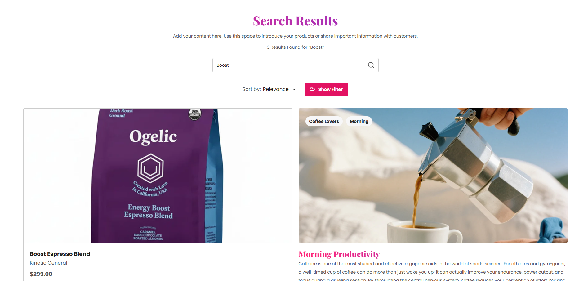
Section Configuration:
Heading:
| Setting |
Description |
| Section Heading |
Defines the main heading displayed on the search results page. |
| Heading Size |
Controls the size of the heading text. |
| Heading Weight |
Adjusts the font thickness of the heading text. |
| Heading Case |
Changes the text transformation style such as uppercase, lowercase, capitalize, or default. |
| Heading Tag |
Sets the HTML heading tag level from H1 to H6 for SEO and accessibility purposes. |
| Heading Font Family |
Allows switching between default and body font family styles. |
| Heading Color Style |
Applies predefined color styling to the heading text. |
| Heading Link Style |
Controls the styling behavior of links used inside the heading content. |
Description:
| Setting |
Description |
| Description Text |
Displays supporting text or information below the search heading. |
| Description Size |
Controls the size of the description text. |
| Description Weight |
Adjusts the font thickness of the description text. |
| Description Case |
Changes the text transformation style of the description text. |
| Description Font Family |
Allows switching between default and heading font family styles. |
| Description Color Style |
Applies predefined color styling to the description text. |
Grid Layout
| Setting |
Description |
| Desktop Columns |
Controls the number of product columns displayed on desktop devices. |
| Desktop Rows |
Controls the number of rows displayed on desktop devices. |
| Mobile Columns |
Controls the number of columns displayed on mobile devices. |
| Desktop Grid Spacing |
Adds spacing between product cards on desktop devices. |
| Mobile Grid Spacing |
Adds spacing between product cards on mobile devices. |
Product Card Settings
| Setting |
Description |
| Product Media Ratio |
Controls the aspect ratio of product images such as adapt, square, portrait, landscape, or fit to box. |
| Product Desktop Height |
Controls the height of product images on desktop devices when fit mode is enabled. |
| Product Mobile Height |
Controls the height of product images on mobile devices when fit mode is enabled. |
Card Alignment:
| Setting |
Description |
| Card Text Alignment (Desktop) |
Sets the horizontal alignment of product card content on desktop devices. |
| Card Text Alignment (Mobile) |
Sets the horizontal alignment of product card content on mobile devices. |
Product Settings
Layout & Typography:
| Setting |
Description |
| Product Layout Style |
Controls the visual card layout style for products. |
| Product Heading Size |
Controls the size of product titles. |
| Product Heading Weight |
Adjusts the font thickness of product titles. |
| Product Heading Case |
Changes the text transformation style for product titles. |
| Product Heading Tag |
Sets the HTML heading tag level for product titles. |
| Product Heading Font Family |
Allows switching between default and body font family styles. |
| Product Heading Color Style |
Applies predefined color styling to product titles. |
Product Features:
| Setting |
Description |
| Enable Reviews |
Displays review bars or rating information on product cards. |
| Enable Add to Cart |
Displays add-to-cart buttons on product cards. |
| Enable Quick View |
Displays quick view functionality for products. |
| Show Price |
Displays product pricing information. |
| Show Unit Price |
Displays unit pricing information. |
| Show Vendor |
Displays product vendor or brand name. |
| Show Stock Tag |
Displays stock availability labels. |
| Show Sale Tag |
Displays sale badges on discounted products. |
| Show Custom Tag |
Displays custom labels or tags on product cards. |
| Show Custom Features |
Displays custom feature lists configured for products. |
Review Bar Settings:
| Setting |
Description |
| Profile Icon |
Uploads a profile image used inside the review bar. |
| Trust Icon |
Uploads a trust badge or trust-related icon. |
| Rating Value |
Defines the product rating score displayed inside the review bar. |
| Rating Color |
Controls the color of the rating stars or rating text. |
| Review Text |
Displays review-related content such as stars and review counts. |
| Review Text Size |
Controls the size of review text content. |
| Review Text Weight |
Adjusts the font thickness of review text. |
| Review Text Case |
Changes the text transformation style for review text. |
| Review Font Family |
Allows switching between default and heading font family styles. |
| Review Color Style |
Applies predefined color styling to review text. |
| Separator Color |
Controls the separator color between split review sections. |
Split Review Settings:
| Setting |
Description |
| Enable Split Reviews |
Splits the review bar into two separate review sections. |
| Left Review Text |
Defines the left-side review content. |
| Left Background Color |
Controls the background color of the left review section. |
| Left Text Color |
Controls the text color of the left review section. |
| Left Border Color |
Controls the border color of the left review section. |
| Right Review Text |
Defines the right-side review content. |
| Right Background Color |
Controls the background color of the right review section. |
| Right Text Color |
Controls the text color of the right review section. |
| Right Border Color |
Controls the border color of the right review section. |
Blog Card Settings:
| Setting |
Description |
| Blog Heading Weight |
Adjusts the font thickness of blog card titles. |
| Blog Heading Case |
Changes the text transformation style for blog titles. |
| Blog Heading Tag |
Sets the HTML heading tag level for blog card titles. |
| Blog Heading Font Family |
Allows switching between default and body font family styles. |
| Blog Heading Color Style |
Applies predefined color styling to blog card titles. |
| Show Featured Image |
Displays featured images inside blog cards. |
| Show Tags |
Displays blog tags on cards. |
| Show Date |
Displays article publishing dates. |
| Show Author |
Displays article author names. |
| Show Excerpt |
Displays article excerpts. |
| Show Comments Count |
Displays total comment counts for blog articles. |
Page Settings:
| Setting |
Description |
| Page Description Size |
Controls the size of page result descriptions. |
| Page Description Weight |
Adjusts the font thickness of page result descriptions. |
| Page Description Case |
Changes the text transformation style for page descriptions. |
| Page Description Font Family |
Allows switching between default and heading font family styles. |
Layout:
| Setting |
Description |
| Container Layout |
Determines whether the search section uses a contained, contained content, or full-width layout. |
| Container Width |
Controls the maximum width of the search section container on desktop devices. |
| Text Alignment (Desktop) |
Sets the horizontal alignment of content on desktop devices. |
| Text Alignment (Mobile) |
Sets the horizontal alignment of content on mobile devices. |
Color Scheme:
| Setting |
Description |
| Section Color Scheme |
Applies a predefined color palette to the search section background and content. |
| Filter Color Scheme |
Applies a predefined color palette to the filter sidebar or filter controls. |
| Inverse Color Scheme |
Inverts the selected color scheme styling for contrast variations. |
| Gradient Mode |
Enables gradient styling for the section background, widgets, or both. |
| Enable Heading Gradient |
Enables gradient styling for section headings. |
| Setting |
Description |
| Enable Product Counts |
Displays the total number of search results or products found. |
| Enable Sorting |
Displays sorting options for search results. |
| Enable Filters |
Displays filtering functionality for products and content. |
| Pagination Type |
Controls the pagination style such as numbered pagination, click to load, or load more button. |
Inner Spacing
| Setting |
Description |
| Top Padding (Desktop) |
Adds spacing inside the top area of the search section on desktop devices. |
| Bottom Padding (Desktop) |
Adds spacing inside the bottom area of the search section on desktop devices. |
| Left Padding (Desktop) |
Controls the inner left spacing of the search section on desktop devices. |
| Right Padding (Desktop) |
Controls the inner right spacing of the search section on desktop devices. |
| Top Padding (Mobile) |
Adds spacing inside the top area of the search section on mobile devices. |
| Bottom Padding (Mobile) |
Adds spacing inside the bottom area of the search section on mobile devices. |
| Left Padding (Mobile) |
Controls the inner left spacing of the search section on mobile devices. |
| Right Padding (Mobile) |
Controls the inner right spacing of the search section on mobile devices. |
Outer Spacing:
| Setting |
Description |
| Top Margin (Desktop) |
Adds spacing outside the top area of the search section on desktop devices. |
| Bottom Margin (Desktop) |
Adds spacing outside the bottom area of the search section on desktop devices. |
| Left Margin (Desktop) |
Controls the outer left spacing of the search section on desktop devices. |
| Right Margin (Desktop) |
Controls the outer right spacing of the search section on desktop devices. |
| Top Margin (Mobile) |
Adds spacing outside the top area of the search section on mobile devices. |
| Bottom Margin (Mobile) |
Adds spacing outside the bottom area of the search section on mobile devices. |
| Left Margin (Mobile) |
Controls the outer left spacing of the search section on mobile devices. |
| Right Margin (Mobile) |
Controls the outer right spacing of the search section on mobile devices. |
