Collection services template
Overview
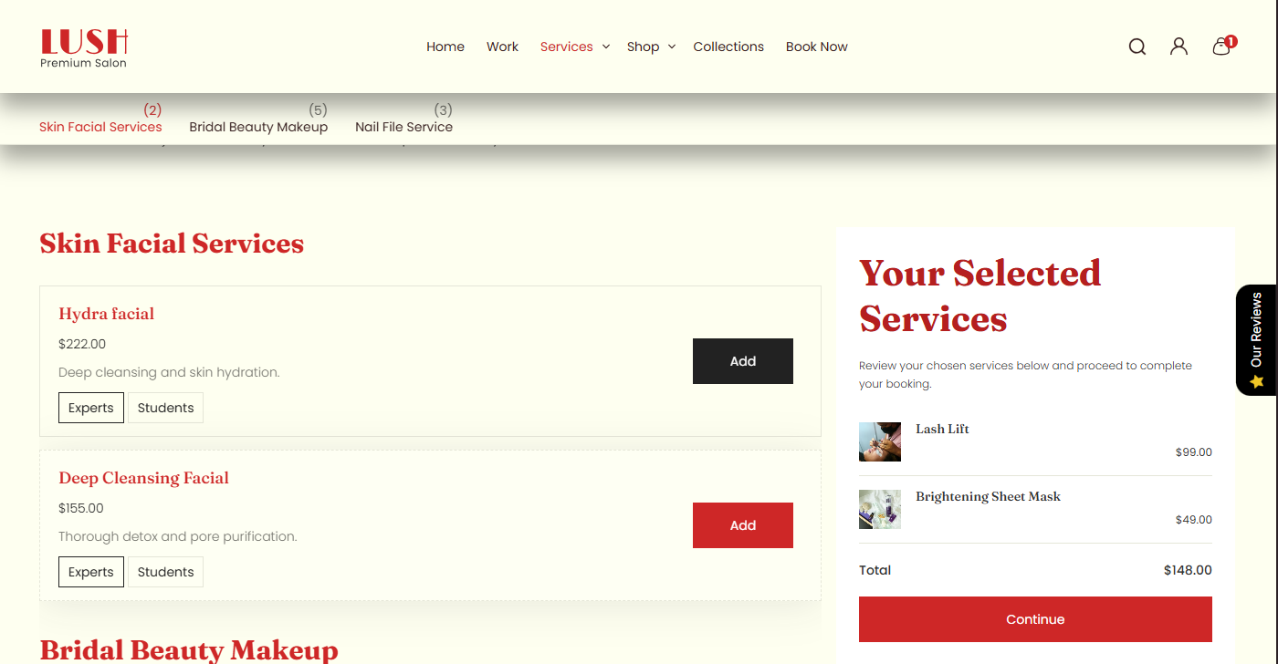
The Main Products Grid section renders a product listing grid (commonly used on collection pages and product listing templates). It supports an optional description widget (heading + rich text), configurable grid density, product card options (unit price, media ratio, tags view), filters + sorting, pagination behavior, and full responsive layout controls (container width, alignment, color schemes, inner/outer padding).
Section Configuration:
Description styling
| Setting |
Description |
| Description size |
Controls the text size for the description output (large / medium / small). |
| Description weight |
Controls font weight for description (100–900). |
| Description case |
Controls text transform (none / uppercase / capitalize / lowercase). |
Grid settings
| Setting |
Description |
| Desktop rows |
Number of rows visible on desktop (2–6). |
| Mobile columns |
Number of columns on mobile (1–2). |
| Gap |
Spacing between grid items. |
Card settings
| Setting |
Description |
| Show unit price |
Toggles unit price display on product cards (if available). |
These settings control a widget-style heading + description area that can be shown above or below the product grid.
| Setting |
Description |
| Widget heading |
Main widget heading text. |
| Heading size |
Heading size preset (h1–h6 or text-size variants). |
| Heading weight |
Heading font weight (100–900). |
| Heading case |
Text transform for heading. |
| Heading tag |
HTML tag used for heading output (h1–h6). |
| Heading link styles |
Link preset styling for heading (theme-specific). |
| Widget description |
Rich text content for the widget. |
| Text size |
Body text size for widget description. |
| Text weight |
Body text weight for widget description. |
| Text case |
Body text transform for widget description. |
Layout & controls
| Setting |
Description |
| Description position |
Controls whether the description is hidden or shown at the top or bottom of the grid. |
| Enable filters |
Enables storefront filtering controls (availability depends on your Shopify filter setup). |
| Show product counts |
Shows product counts within filters (theme/filter UI dependent). |
| Enable sort |
Enables sorting controls for the product grid. |
| Pagination type |
Controls how additional products are loaded: pagination, click to load, or load more button style. |
| Container layout |
Controls how the section is sized on the page: page-width (boxed), contained-content, or container-fluid (full width). |
| Container size (Desktop) |
Sets the maximum section width on desktop as a percentage (50%–100%). |
| Color scheme |
Applies a theme color scheme to the product grid section styling. |
| Filter color scheme |
Applies a separate color scheme to the filter/sort UI area. |
| Text alignment (Desktop) |
Controls text alignment on desktop (left, center, right). |
| Text alignment (Mobile) |
Controls text alignment on mobile (left, center, right). |
Inner padding
| Setting |
Description |
| Top (Desktop) |
Inner spacing above content (desktop). |
| Bottom (Desktop) |
Inner spacing below content (desktop). |
| Left (Desktop) |
Inner spacing left (desktop). |
| Right (Desktop) |
Inner spacing right (desktop). |
| Top (Mobile) |
Inner spacing above content (mobile). |
| Bottom (Mobile) |
Inner spacing below content (mobile). |
| Left (Mobile) |
Inner spacing left (mobile). |
| Right (Mobile) |
Inner spacing right (mobile). |
Outer padding
| Setting |
Description |
| Top (Desktop) |
Outer spacing above section (desktop). |
| Bottom (Desktop) |
Outer spacing below section (desktop). |
| Left (Desktop) |
Outer spacing left (desktop). |
| Right (Desktop) |
Outer spacing right (desktop). |
| Top (Mobile) |
Outer spacing above section (mobile). |
| Bottom (Mobile) |
Outer spacing below section (mobile). |
| Left (Mobile) |
Outer spacing left (mobile). |
| Right (Mobile) |
Outer spacing right (mobile). |
Blocks Configuration:
Heading block
| Block |
Description |
| Heading |
Optional heading group for section title/intro (theme-defined structure). |