Theme Settings
Overview
The Theme Settings control your store’s global styling and behavior across the entire theme. This includes color schemes, page width, typography, buttons/inputs styling, service form text + styling, product/collection swatches & badges, cart behavior, authentication pages styling, social media links, and gift card branding.
Color Scheme:
From here, you can select the colors you want to use throughout the theme. You can create multiple unique color schemes and apply them to different sections throughout your online store.
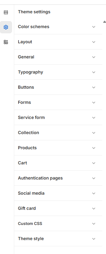
Customize your color scheme:
- From your shopify admin, go to Online Store > Themes
- Click Customize next to the theme that you want to customize.
- Click the settings icon, and then click Color schemes.
- In the Schemes section, click an existing scheme or click Add scheme to add a new color scheme.
- Click the color swatch for the content type color that you want to change.
- To set your color, enter a hex color code or choose the color from the color picker. To set the color to transparent, delete the hex code from the text field.
- Click Save.
Layout Settings
Adjust the overall structure and spacing of your theme:
Setting |
Description |
|---|---|
| Page Width | Controls the maximum width of the page. Range: 1240px - 1440px. Default: 1350px. |
General Settings
General configurations for icons and currency.
Setting |
Description |
|---|---|
| Favicon | Upload a favicon icon for the browser tab. |
| Currency Format | Choose to display the currency code next to prices. Default: Disabled. |
|
Enable viewport animations |
Enable Viewport Animations controls whether animations trigger when elements enter the visible area of the screen.
|
Typography
Control fonts and text scaling:
Setting |
Description |
|---|---|
| Body Font | Choose a font for the site’s body text. Default: Poppins |
| Font Scale | Adjust the scaling percentage of text sizes. Range: 90% - 110%. Default: 100%. |
| Headings Font | Choose a font for headings. Default: Fraunces |
Buttons:
You can adjust the borders and thickness of some interactive content types, such as drawers, buttons, variants or quantity inputs.
Customize Buttons:
- From your shopify admin, go to Online Store > Themes
- Click Customize next to the theme that you want to customize.
- Click Theme settings > Buttons.
- By moving the range slider to change the appearance of your button Border.
- By moving the range slider to change the Corner radius of your button.
- Click Save.
Forms:
Inputs are interactive areas that require customer input, for example a quantity selector, an email signup form, or cart notes.
Customize Inputs:
- From your shopify admin, go to Online Store > Themes
- Click Customize next to the theme that you want to customize.
- Click Theme settings > Inputs
- By moving the range slider to change the appearance of your input Border.
- By moving the range slider to change the Corner radius of your input.
- Click Save.
Service Form
Configuration
Selected Services Header
| Setting | Description |
|---|---|
| Service heading | Main heading text (e.g., “Your Selected Services”). |
| Heading size | Heading size preset. |
| Heading weight | Font weight for heading. |
| Heading case | Text transform (uppercase/capitalize/etc.). |
| Heading tag | HTML tag used (h1–h6). |
| Heading family | Font family preset (default/body). |
| Service description | Supporting description text under heading. |
| Description size | Size preset for description. |
| Description weight | Font weight for description. |
| Description case | Text transform for description. |
Form Header (Complete booking area)
| Setting | Description |
|---|---|
| Form heading | “Complete Your Booking” text. |
| Form heading size | Size preset for form heading. |
| Form heading weight | Weight for form heading. |
| Form heading case | Case transform for form heading. |
| Form heading tag | HTML tag used. |
| Form heading family | Font family preset (default/body). |
| Form description | Supporting form description text. |
| Form description size | Size preset for form description. |
| Form description weight | Weight for form description. |
| Form description case | Case transform for form description. |
| Service form color scheme | Color scheme used for the service form widget/area. |
Collection
Adds advanced customization: per-collection custom scheme/badge rules via text syntax.
Configuration
| Setting | Description |
|---|---|
| Collection custom color scheme | Define custom colors per collection handle using a structured format. |
| Collection custom badges | Define custom badge text + colors per collection handle. |
Products
Controls variant swatches display mode and custom badge/tag colors for products.
Configuration
Variant Swatches
| Setting | Description |
|---|---|
| Variant swatches | Swatches display mode: none / swatches / colors / images. |
| Swatches custom values | Define custom swatch mapping values (theme-specific syntax). |
Sale tag
| Setting | Description |
|---|---|
| Sale tag color | Text color for sale label. |
| Sale tag background | Background for sale label. |
Stock tags
| Setting | Description |
|---|---|
| Sold out tag color / bg | Colors for sold out label. |
| Pre-order tag color / bg | Colors for pre-order label. |
| In stock tag color / bg | Colors for in-stock label. |
| Low stock tag color / bg | Colors for low-stock label. |
Custom Tags / Badges
| Setting | Description |
|---|---|
| Product custom badges | Define custom badge rules like {New,#000,#fff} format. |
Cart
Controls cart experience: drawer/page, notes, discount, free shipping progress message, related products in drawer, autoplay slider options, etc.
Configuration
Cart behavior
| Setting | Description |
|---|---|
| Cart view | Drawer or full page cart. |
| Enable order notes | Allows customers to add notes. |
| Enable discount | Shows discount code input. |
| Enable free shipping message | Shows progress/free shipping message. |
| Show drawer vendor | Shows vendor in cart drawer. |
Free shipping message
| Setting | Description |
|---|---|
| Free shipping text | Text template. Uses ` |
| Free shipping amount | Minimum amount required for free shipping. |
Cart Drawer UI + Related products
| Setting | Description |
|---|---|
| Cart drawer color scheme | Color scheme applied to drawer. |
| Related heading | Title for related slider. |
| Related collection | Collection used for related products. |
| Max related to show | Max products shown in slider. |
| Enable ATC | Enable add-to-cart buttons in related slider. |
| Auto play | Autoplay slider on/off. |
| Show arrows | Show slider arrows. |
| Change slides every | Interval between slide changes. |
Authentication Pages
Controls logo + styling for Login/Register/Reset/Activate/Password pages, including headings, typography, and color schemes.
Configuration
Site logo
| Setting | Description |
|---|---|
| Auth logo | Logo shown on auth pages. |
| Logo desktop width | Desktop logo width. |
| Logo mobile width | Mobile logo width. |
Login page
| Setting | Description |
|---|---|
| Enable shop login | Enable Shopify “Shop login” option. |
| Login heading | Heading text. |
| Heading size/weight/case/family | Typography controls. |
| Login color scheme | Applied scheme for login page. |
Register / Reset / Activate pages
| Setting | Description |
|---|---|
| Register heading + typography | Controls register page header look. |
| Register color scheme | Scheme for register page. |
| Reset heading + typography | Controls reset page header look. |
| Reset color scheme | Scheme for reset page. |
| Activate heading + typography | Controls activate page header look. |
| Activate color scheme | Scheme for activate page. |
Password page
| Setting | Description |
|---|---|
| Heading + typography | Controls password page heading + style. |
| Color scheme | Scheme for password page. |
Account pages
| Setting | Description |
|---|---|
| Heading size/weight/case/family | Global account header typography. |
| Menu weight | Weight for account navigation. |
| Color scheme | Scheme for account pages. |
| Widget color scheme | Scheme for account widgets/blocks. |
Social Media
Stores your social profile links used in header/footer icons and social blocks.
Configuration
| Setting | Description |
|---|---|
| Instagram/LinkedIn/Facebook/YouTube/etc. links | Paste full URLs for each platform. |
Gift Card
Controls gift card template branding (logo sizes + scheme).
Configuration
| Setting | Description |
|---|---|
| Gift card logo | Logo shown on gift card page. |
| Logo desktop width | Desktop width for gift card logo. |
| Logo mobile width | Mobile width for gift card logo. |
| Gift card color scheme | Scheme applied to gift card template. |