Blog page
Overview
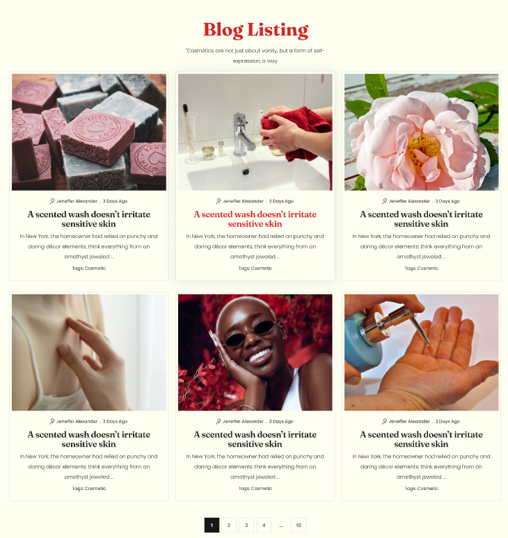
The Main Blog section displays blog articles in a grid layout on a blog page. You can control the number of columns and rows on desktop, the number of columns on mobile, spacing between cards, article card media ratio, and overall section layout (container width, alignment, color scheme, and responsive spacing).
Section Configuration:
Grid settings
| Setting | Description |
|---|---|
| Desktop columns | Sets how many article cards are shown per row on desktop (1–4). |
| Desktop rows | Sets how many rows of articles are displayed on desktop (2–6). |
| Mobile columns | Sets how many article cards are shown per row on mobile (1 or 2). |
| Gap | Controls spacing between article cards in the grid. |
Layout
| Setting | Description |
|---|---|
| Media ratio | Sets the aspect ratio used for article card media (Adapt, Square, Portrait, Landscape). |
| Container layout | Controls how the section is sized on the page: page-width (boxed), contained-content, or container-fluid (full width). |
| Container size (Desktop) | Sets the maximum section width on desktop as a percentage (50%–100%). |
| Text alignment (Desktop) | Controls text alignment for section content on desktop (left, center, right). |
| Text alignment (Mobile) | Controls text alignment for section content on mobile (left, center, right). |
| Color scheme | Applies a theme color scheme to the section styling. |
Inner padding
| Setting | Description |
|---|---|
| Top (Desktop) | Adds space above the section content on desktop. |
| Bottom (Desktop) | Adds space below the section content on desktop. |
| Left (Desktop) | Adds space to the left of the section content on desktop. |
| Right (Desktop) | Adds space to the right of the section content on desktop. |
| Top (Mobile) | Adds space above the section content on mobile. |
| Bottom (Mobile) | Adds space below the section content on mobile. |
| Left (Mobile) | Adds space to the left of the section content on mobile. |
| Right (Mobile) | Adds space to the right of the section content on mobile. |
Outer padding
| Setting | Description |
|---|---|
| Top (Desktop) | Adds space above the section on desktop. |
| Bottom (Desktop) | Adds space below the section on desktop. |
| Left (Desktop) | Adds space on the left side of the section on desktop. |
| Right (Desktop) | Adds space on the right side of the section on desktop. |
| Top (Mobile) | Adds space above the section on mobile. |
| Bottom (Mobile) | Adds space below the section on mobile. |
| Left (Mobile) | Adds space on the left side of the section on mobile. |
| Right (Mobile) | Adds space on the right side of the section on mobile. |