Collection listing
Overview
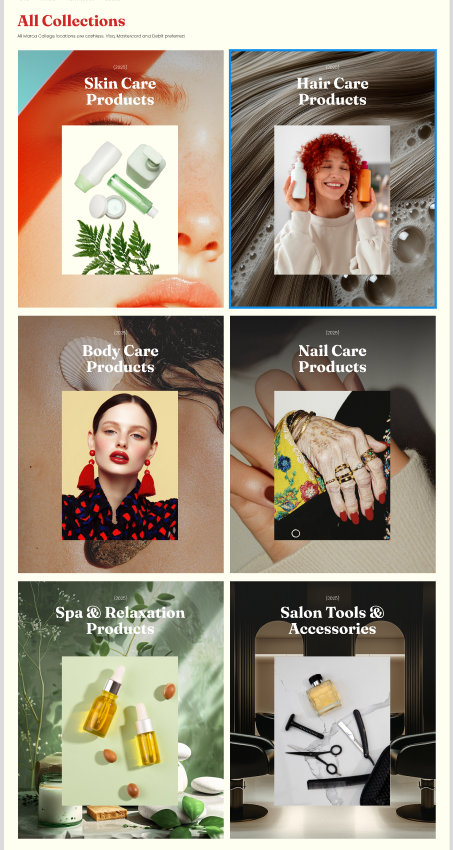
The Main Collections section is used to display your store’s collections in a grid layout (commonly on the “All collections” page). You can control how collections are sorted, set the number of columns on desktop and mobile, adjust spacing, choose the collection card media ratio, and customize container width, alignment, color scheme, and responsive spacing.
Section Configuration:
Sorting
| Setting |
Description |
| Sort by |
Controls the order collections are displayed in (alphabetical, reverse alphabetical, newest/oldest first, or by product count high/low). |
Grid settings
| Setting |
Description |
| Desktop columns |
Sets how many collection cards are shown per row on desktop (1–3). |
| Mobile columns |
Sets how many collection cards are shown per row on mobile (1 or 2). |
| Gap |
Controls spacing between collection cards in the grid. |
Layout
| Setting |
Description |
| Media ratio |
Sets the aspect ratio used for collection card media (Adapt, Square, Portrait, Landscape). |
| Container layout |
Controls how the section is sized on the page: page-width (boxed), contained-content, or container-fluid (full width). |
| Container size (Desktop) |
Sets the maximum section width on desktop as a percentage (50%–100%). |
| Color scheme |
Applies a theme color scheme to the section styling. |
| Text alignment (Desktop) |
Controls text alignment for section content on desktop (left, center, right). |
| Text alignment (Mobile) |
Controls text alignment for section content on mobile (left, center, right). |
Inner padding
| Setting |
Description |
| Top (Desktop) |
Adds space above the section content on desktop. |
| Bottom (Desktop) |
Adds space below the section content on desktop. |
| Left (Desktop) |
Adds space to the left of the section content on desktop. |
| Right (Desktop) |
Adds space to the right of the section content on desktop. |
| Top (Mobile) |
Adds space above the section content on mobile. |
| Bottom (Mobile) |
Adds space below the section content on mobile. |
| Left (Mobile) |
Adds space to the left of the section content on mobile. |
| Right (Mobile) |
Adds space to the right of the section content on mobile. |
Outer padding
| Setting |
Description |
| Top (Desktop) |
Adds space above the section on desktop. |
| Bottom (Desktop) |
Adds space below the section on desktop. |
| Left (Desktop) |
Adds space on the left side of the section on desktop. |
| Right (Desktop) |
Adds space on the right side of the section on desktop. |
| Top (Mobile) |
Adds space above the section on mobile. |
| Bottom (Mobile) |
Adds space below the section on mobile. |
| Left (Mobile) |
Adds space on the left side of the section on mobile. |
| Right (Mobile) |
Adds space on the right side of the section on mobile. |
Blocks Configuration:
Section-level blocks
| Block type |
Description |
Theme block (@theme ) |
Allows theme-provided blocks to be added to this section (based on what your theme supports). |
App block (@app ) |
Allows compatible Shopify apps to add app blocks to this section. |
