Collection page
Overview
The Main Products Grid section is used on collection and search-style listing pages to display products in a configurable grid. It supports optional collection/section description placement, storefront filtering and sorting controls, and multiple pagination styles. You can also adjust product card appearance (media ratio, tag display style, variant behavior), grid layout (columns, rows, gaps), filter styling, and standard layout settings (container width, alignment, color scheme, and responsive spacing).
Section Configuration:
Description styling
| Setting |
Description |
| Description size |
Controls the text size preset used for the section/collection description (if displayed). |
| Description weight |
Sets the font weight used for the section/collection description. |
| Description case |
Controls capitalization styling for the section/collection description text. |
Card
| Setting |
Description |
| Media ratio |
Sets the aspect ratio used for product card media (Adapt, Square, Portrait, Landscape). |
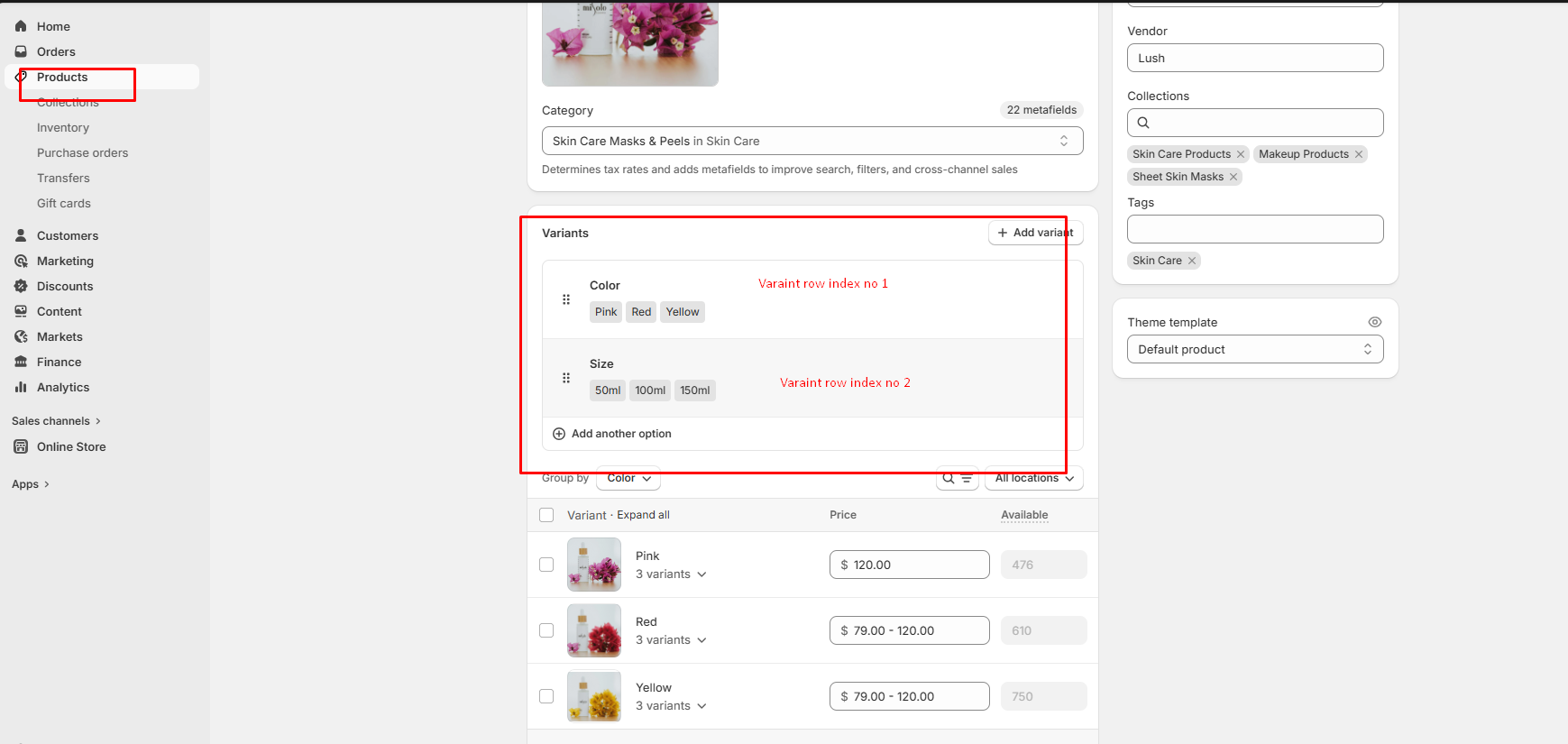
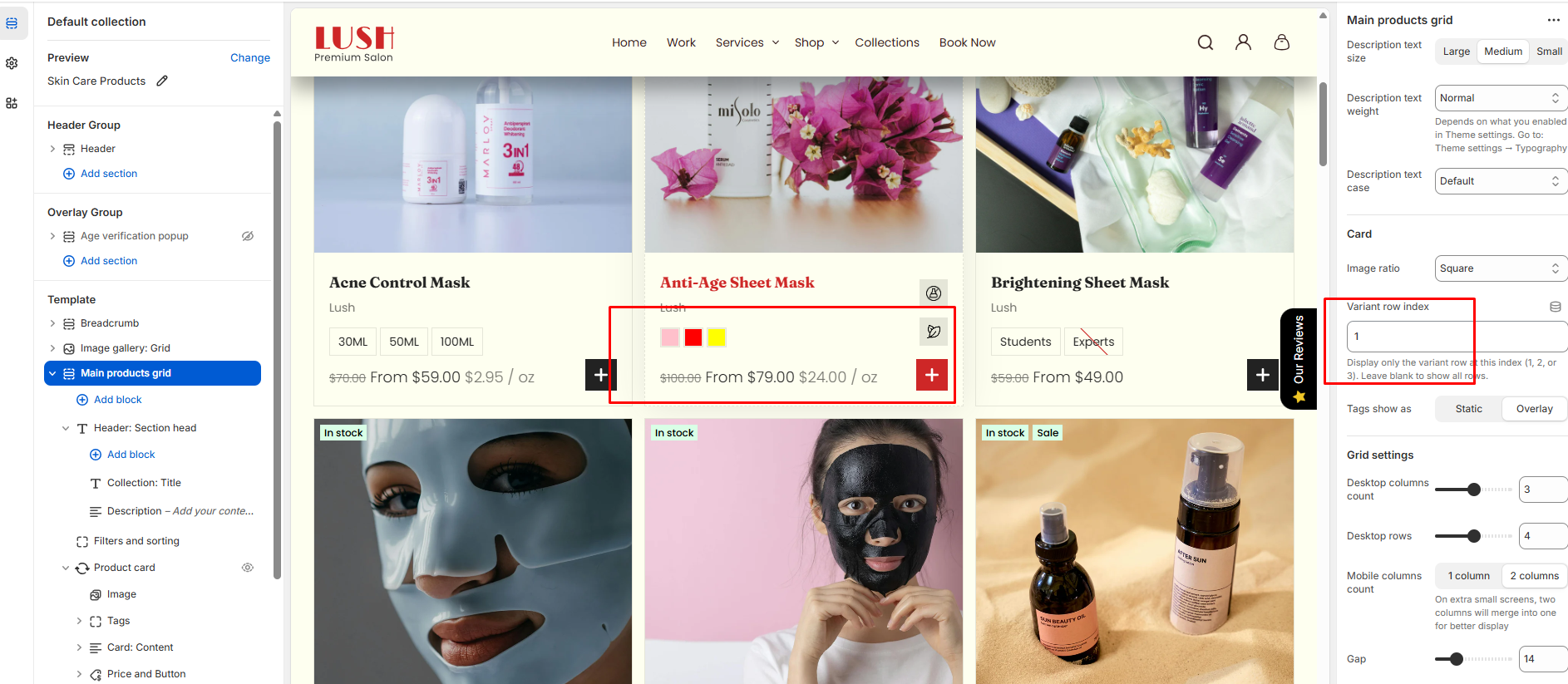
| Variant row index |
Defines which product option/variant row is used for variant-related display behavior (theme-dependent).
Note: If this field is left empty, all the variants that have been created will be displayed automatically.
|
| Product tags display |
Controls how product tags appear on the card (Static or Overlay). |
Grid settings
| Setting |
Description |
| Desktop columns |
Sets how many product columns are shown on desktop (2–4). |
| Desktop rows |
Sets how many rows of products are shown on desktop (2–6). |
| Mobile columns |
Sets how many product columns are shown on mobile (1 or 2). |
| Gap |
Controls spacing between product cards in the grid. |
Layout & controls
| Setting |
Description |
| Description position |
Controls whether the description is hidden or shown at the top or bottom of the grid. |
| Enable filters |
Enables storefront filtering controls (availability depends on your Shopify filter setup). |
| Show product counts |
Shows product counts within filters (theme/filter UI dependent). |
| Enable sort |
Enables sorting controls for the product grid. |
| Pagination type |
Controls how additional products are loaded: pagination, click to load, or load more button style. |
| Container layout |
Controls how the section is sized on the page: page-width (boxed), contained-content, or container-fluid (full width). |
| Container size (Desktop) |
Sets the maximum section width on desktop as a percentage (50%–100%). |
| Color scheme |
Applies a theme color scheme to the product grid section styling. |
| Filter color scheme |
Applies a separate color scheme to the filter/sort UI area. |
| Text alignment (Desktop) |
Controls text alignment on desktop (left, center, right). |
| Text alignment (Mobile) |
Controls text alignment on mobile (left, center, right). |
Inner padding
| Setting |
Description |
| Top (Desktop) |
Adds space above the grid content inside the section on desktop. |
| Bottom (Desktop) |
Adds space below the grid content inside the section on desktop. |
| Left (Desktop) |
Adds space to the left of the grid content inside the section on desktop. |
| Right (Desktop) |
Adds space to the right of the grid content inside the section on desktop. |
| Top (Mobile) |
Adds space above the grid content inside the section on mobile. |
| Bottom (Mobile) |
Adds space below the grid content inside the section on mobile. |
| Left (Mobile) |
Adds space to the left of the grid content inside the section on mobile. |
| Right (Mobile) |
Adds space to the right of the grid content inside the section on mobile. |
Outer padding
| Setting |
Description |
| Top (Desktop) |
Adds space above the section on desktop. |
| Bottom (Desktop) |
Adds space below the section on desktop. |
| Left (Desktop) |
Adds space on the left side of the section on desktop. |
| Right (Desktop) |
Adds space on the right side of the section on desktop. |
| Top (Mobile) |
Adds space above the section on mobile. |
| Bottom (Mobile) |
Adds space below the section on mobile. |
| Left (Mobile) |
Adds space on the left side of the section on mobile. |
| Right (Mobile) |
Adds space on the right side of the section on mobile. |
Blocks Configuration:
Section-level blocks
| Block type |
Description |
| Heading head |
Adds a heading area above the grid (theme-defined heading layout and content). |
Theme block (@theme ) |
Allows theme-provided blocks to be added to this section (based on what your theme supports). |
App block (@app ) |
Allows compatible Shopify apps to add app blocks to this section. |

