Testimonials: Grid
Overview
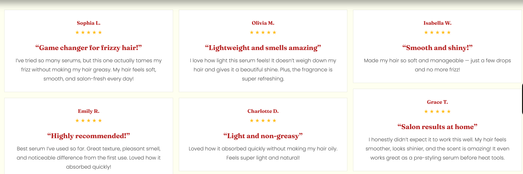
The Testimonials Grid section displays customer testimonials in a multi-column grid. It supports a configurable number of columns and spacing, and includes layout controls for container width, text alignment, color scheme, and responsive padding. The preset includes a heading area followed by a testimonial listing container with testimonial cards (name, rating, title, and review text).
Section Configuration:
Grid settings
| Setting |
Description |
| Desktop columns |
Sets how many testimonial columns are shown on desktop (1–4). |
| Mobile columns |
Sets how many columns are shown on mobile (1 or 2). |
| Gap |
Controls the spacing between testimonial items in the grid. |
Layout
| Setting |
Description |
| Container layout |
Controls how the section is sized on the page: page-width (boxed), contained-content, or container-fluid (full width). |
| Container size (Desktop) |
Sets the maximum section width on desktop as a percentage (50%–100%). |
| Text alignment (Desktop) |
Controls text alignment on desktop (left, center, right). |
| Text alignment (Mobile) |
Controls text alignment on mobile (left, center, right). |
| Color scheme |
Applies a theme color scheme to the section styling. |
Inner padding
| Setting |
Description |
| Top (Desktop) |
Adds space above the section’s inner content on desktop. |
| Bottom (Desktop) |
Adds space below the section’s inner content on desktop. |
| Left (Desktop) |
Adds space to the left of the section’s inner content on desktop. |
| Right (Desktop) |
Adds space to the right of the section’s inner content on desktop. |
| Top (Mobile) |
Adds space above the section’s inner content on mobile. |
| Bottom (Mobile) |
Adds space below the section’s inner content on mobile. |
| Left (Mobile) |
Adds space to the left of the section’s inner content on mobile. |
| Right (Mobile) |
Adds space to the right of the section’s inner content on mobile. |
Outer padding
| Setting |
Description |
| Top (Desktop) |
Adds space above the section (outside the section content) on desktop. |
| Bottom (Desktop) |
Adds space below the section (outside the section content) on desktop. |
| Left (Desktop) |
Adds space on the left side of the section (outside) on desktop. |
| Right (Desktop) |
Adds space on the right side of the section (outside) on desktop. |
| Top (Mobile) |
Adds space above the section (outside) on mobile. |
| Bottom (Mobile) |
Adds space below the section (outside) on mobile. |
| Left (Mobile) |
Adds space on the left side of the section (outside) on mobile. |
| Right (Mobile) |
Adds space on the right side of the section (outside) on mobile. |
Blocks Configuration:
Section-level blocks
| Block type |
Description |
Heading head (_heading-head ) |
Adds a heading area for the section, typically containing a tagline, heading, and description. |
Testimonial content (_testimonial-content ) |
Adds the testimonial listing area where testimonial cards are displayed. |
Theme block (@theme ) |
Allows theme-provided blocks to be added to this section (based on what your theme supports). |
App block (@app ) |
Allows compatible Shopify apps to add app blocks to this section. |
Heading
| Block |
Description |
| Tagline |
Displays a short line of text above the main heading. |
| Heading |
Displays the main section title. |
| Description |
Displays supporting text beneath the heading. |
Testimonial Content
| Block |
Description |
| Testimonial listing |
Displays testimonials in a structured grid layout and contains testimonial columns/cards. |
Testimonial column
| Block |
Description |
| Testimonial column |
Represents one column/group within the testimonial grid layout. |
Testimonial card
A single testimonial entry, typically including a client name, rating, title, and review text.
| Card block |
Description |
| Client name |
Displays the customer/client name. |
| Rating |
Displays a rating value (for example, star rating). |
| Heading |
Displays a short testimonial title or summary line. |
| Description |
Displays the main testimonial/review text. |
Rating setting
| Setting |
Description |
| Rating |
Sets the rating value displayed in the testimonial card. |
