Product hotspot
Overview
The Product Hotspot section creates a two-part layout that can display:
- a Hotspot Banner area (used for interactive product hotspots), and
- an Appointment Banner area (used for supporting content such as headings, timers, images, and marquee text).
It includes global controls for marquee scrolling behavior, container width, color scheme, text alignment, and separate inner/outer padding for desktop and mobile.
Section Configuration:
| Setting |
Description |
| Marquee direction |
Sets the direction the marquee content scrolls. |
| Marquee speed |
Controls how fast the marquee scrolls. |
| Desktop marquee gap |
Sets the spacing between marquee items on desktop. |
| Mobile marquee gap |
Sets the spacing between marquee items on mobile. |
| Pause on hover |
When enabled, marquee scrolling pauses while hovering. |
Layout
| Setting |
Description |
| Card media size (Image ratio) |
Sets the aspect ratio used for media displayed within the section (Adapt, Square, Portrait, Landscape). |
| Container layout |
Controls how the section is sized on the page: boxed page width, contained content, or full width. |
| Container size (Desktop) |
Sets the maximum section width on desktop as a percentage (50%–100%). |
| Color scheme |
Applies a theme color scheme to the section styling. |
| Text alignment (Desktop) |
Controls text alignment on desktop (left, center, right). |
| Text alignment (Mobile) |
Controls text alignment on mobile (left, center, right). |
Inner padding
| Setting |
Description |
| Top (Desktop) |
Adds space above the section’s inner content on desktop. |
| Bottom (Desktop) |
Adds space below the section’s inner content on desktop. |
| Left (Desktop) |
Adds space to the left of the section’s inner content on desktop. |
| Right (Desktop) |
Adds space to the right of the section’s inner content on desktop. |
| Top (Mobile) |
Adds space above the section’s inner content on mobile. |
| Bottom (Mobile) |
Adds space below the section’s inner content on mobile. |
| Left (Mobile) |
Adds space to the left of the section’s inner content on mobile. |
| Right (Mobile) |
Adds space to the right of the section’s inner content on mobile. |
Outer padding
| Setting |
Description |
| Top (Desktop) |
Adds space above the section (outside the section content) on desktop. |
| Bottom (Desktop) |
Adds space below the section (outside the section content) on desktop. |
| Left (Desktop) |
Adds space on the left side of the section (outside) on desktop. |
| Right (Desktop) |
Adds space on the right side of the section (outside) on desktop. |
| Top (Mobile) |
Adds space above the section (outside) on mobile. |
| Bottom (Mobile) |
Adds space below the section (outside) on mobile. |
| Left (Mobile) |
Adds space on the left side of the section (outside) on mobile. |
| Right (Mobile) |
Adds space on the right side of the section (outside) on mobile. |
Blocks Configuration:
Section-level blocks
| Block type |
Description |
| Theme block |
Allows theme-provided blocks to be added into this section, depending on what your theme supports. |
| App block |
Allows compatible Shopify apps to add app blocks into this section. |
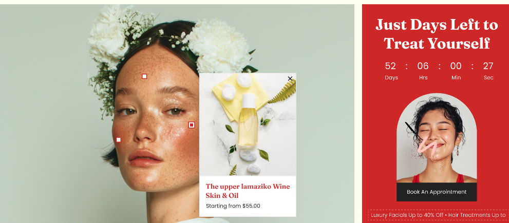
Appointment Banner
This static area is intended for supporting promotional/appointment content (headline, countdown, image, and scrolling text).
Appointment Banner: blocks
| Block |
Description |
| Heading |
Displays a heading inside the appointment banner. |
| Countdown timer |
Displays a countdown timer element in the appointment banner. |
| Image link |
Displays an image that can link to a destination (if configured in the block). |
| Text marquee |
Displays a scrolling marquee row within the appointment banner. |
Text marquee: sub-blocks
| Sub-block |
Description |
| Booking marquee text |
Adds an individual marquee text item to the scrolling row. The text size can be set per item. |
Hotspot Banner
This static area is designed to show an image/figure with clickable or highlighted hotspots.
Hotspot Banner: blocks
| Block |
Description |
| Hotspot |
Adds a hotspot marker positioned over the hotspot banner media. Positions can be set separately for desktop and mobile. |
| Setting |
Description |
| Position top (Desktop) |
Sets the hotspot’s vertical position on desktop (typically as a percentage from the top). |
| Position left (Desktop) |
Sets the hotspot’s horizontal position on desktop (typically as a percentage from the left). |
| Position top (Mobile) |
Sets the hotspot’s vertical position on mobile (typically as a percentage from the top). |
| Position left (Mobile) |
Sets the hotspot’s horizontal position on mobile (typically as a percentage from the left). |
