Collection: Showcase
Overview
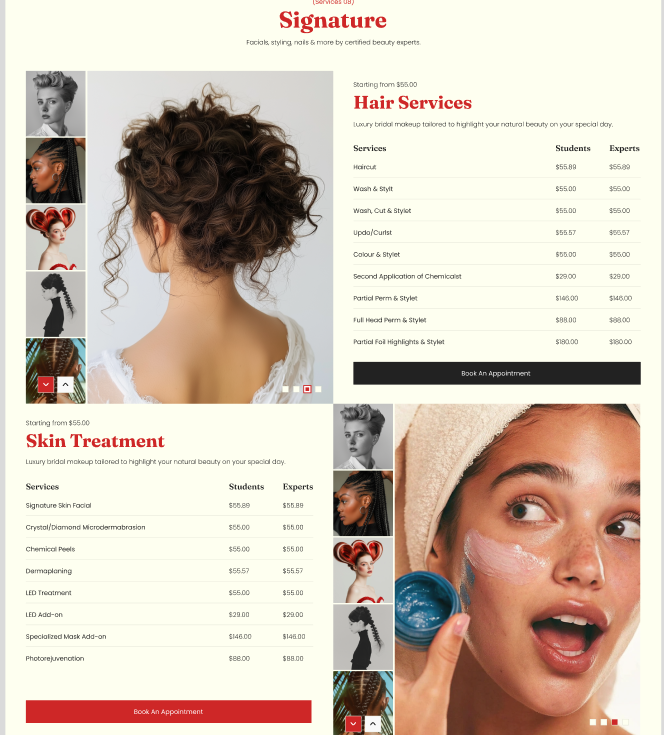
The Collection Showcase section highlights a selected collection with a featured media area and a structured product listing. You can choose the collection, control how many products appear, adjust media sizing and placement for desktop and mobile, and customize container width, color scheme, alignment, and responsive spacing. The preset includes a heading area plus a showcase layout with gallery and listing components.
Section Configuration:
Collection
| Setting |
Description |
| Collection |
Selects the collection to feature in the section. |
| Max products to show |
Sets the maximum number of products from the selected collection to display (2–10). |
Layout
| Setting |
Description |
| Desktop media size |
Sets the media area height/size on desktop (Small: 511px, Medium: 606px, Large: 731px). |
| Mobile media size |
Sets the media area height/size on mobile (Small: 220px, Medium: 280px, Large: 334px). |
| Desktop media position |
Controls whether the media appears on the left or right side on desktop. |
| Container layout |
Controls how the section is sized on the page: page-width (boxed), contained-content, or container-fluid (full width). |
| Container size (Desktop) |
Sets the maximum section width on desktop as a percentage (50%–100%). |
| Color scheme |
Applies a theme color scheme to the section styling. |
| Text alignment (Desktop) |
Controls text alignment on desktop (left, center, right). |
| Text alignment (Mobile) |
Controls text alignment on mobile (left, center, right). |
Inner padding
| Setting |
Description |
| Top (Desktop) |
Adds space above the section’s inner content on desktop. |
| Bottom (Desktop) |
Adds space below the section’s inner content on desktop. |
| Left (Desktop) |
Adds space to the left of the section’s inner content on desktop. |
| Right (Desktop) |
Adds space to the right of the section’s inner content on desktop. |
| Top (Mobile) |
Adds space above the section’s inner content on mobile. |
| Bottom (Mobile) |
Adds space below the section’s inner content on mobile. |
| Left (Mobile) |
Adds space to the left of the section’s inner content on mobile. |
| Right (Mobile) |
Adds space to the right of the section’s inner content on mobile. |
Outer padding
| Setting |
Description |
| Top (Desktop) |
Adds space above the section (outside the section content) on desktop. |
| Bottom (Desktop) |
Adds space below the section (outside the section content) on desktop. |
| Left (Desktop) |
Adds space on the left side of the section (outside) on desktop. |
| Right (Desktop) |
Adds space on the right side of the section (outside) on desktop. |
| Top (Mobile) |
Adds space above the section (outside) on mobile. |
| Bottom (Mobile) |
Adds space below the section (outside) on mobile. |
| Left (Mobile) |
Adds space on the left side of the section (outside) on mobile. |
| Right (Mobile) |
Adds space on the right side of the section (outside) on mobile. |
Blocks Configuration:
Heading
A heading area that introduces the section.
| Block |
Description |
| Tagline |
Displays a short line of text above the main heading. |
| Heading |
Displays the main section title. |
| Description |
Displays supporting text beneath the heading. |
Collection Showcase
| Block |
Description |
| Collection showcase |
Displays the featured collection layout and contains the gallery, collection header, and product listing elements. |
Gallery
| Block |
Description |
| Showcase gallery |
Displays a media/gallery area associated with the selected collection. |
A collection header area used within the showcase layout.
| Block |
Description |
| Collection tagline |
Displays a short tagline for the collection header area. |
| Collection title |
Displays the collection title within the showcase area. |
| Collection description |
Displays supporting text for the collection within the showcase header area. |
Product listing
Displays a structured list/table-style product view for the collection.
| Block |
Description |
| Showcase listing |
Displays the collection’s products in a listing/table layout. |
| Block |
Description |
| Header |
Displays column labels for the product listing (for example, product name and price). |
Rows
| Block |
Description |
| Row |
Displays an individual product entry within the listing, typically including a product title and price. |
| Block |
Description |
| Button |
Displays a call-to-action button related to the collection (commonly linking to the collection page). |
