Image gallery: Grid
Overview
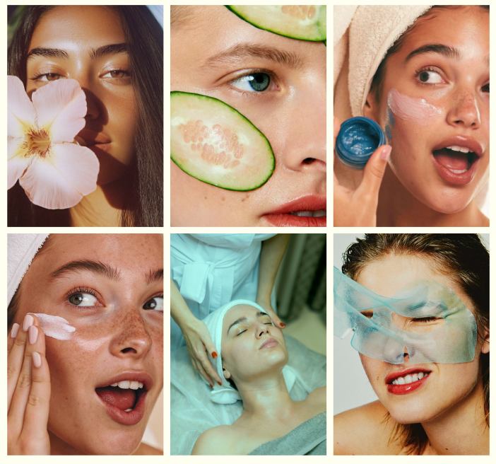
The Image Gallery section displays a grid-based gallery of images. You can control the number of columns for desktop and mobile, spacing between images, media ratio, container width, color scheme, optional scroll-fade animation, text alignment, and responsive padding. The preset includes a heading area followed by an image gallery container with multiple image items.
Section Configuration:
Grid settings
| Setting |
Description |
| Desktop columns |
Sets how many image columns are shown on desktop (1–4). |
| Mobile columns |
Sets how many columns are shown on mobile (1 or 2). |
| Gap |
Controls the spacing between images in the gallery. |
Layout
| Setting |
Description |
| Media ratio |
Sets the aspect ratio used for gallery images (Adapt, Square, Portrait, Landscape). |
| Container layout |
Controls how the section is sized on the page: page-width (boxed), contained-content, or container-fluid (full width). |
| Container size (Desktop) |
Sets the maximum section width on desktop as a percentage (50%–100%). |
| Color scheme |
Applies a theme color scheme to the section styling. |
| Scroll fade animation |
When enabled, applies a fade-in effect as the section enters the viewport. |
| Text alignment (Desktop) |
Controls text alignment on desktop (left, center, right). |
| Text alignment (Mobile) |
Controls text alignment on mobile (left, center, right). |
Inner padding
| Setting |
Description |
| Top (Desktop) |
Adds space above the section’s inner content on desktop. |
| Bottom (Desktop) |
Adds space below the section’s inner content on desktop. |
| Left (Desktop) |
Adds space to the left of the section’s inner content on desktop. |
| Right (Desktop) |
Adds space to the right of the section’s inner content on desktop. |
| Top (Mobile) |
Adds space above the section’s inner content on mobile. |
| Bottom (Mobile) |
Adds space below the section’s inner content on mobile. |
| Left (Mobile) |
Adds space to the left of the section’s inner content on mobile. |
| Right (Mobile) |
Adds space to the right of the section’s inner content on mobile. |
Outer padding
| Setting |
Description |
| Top (Desktop) |
Adds space above the section (outside the section content) on desktop. |
| Bottom (Desktop) |
Adds space below the section (outside the section content) on desktop. |
| Left (Desktop) |
Adds space on the left side of the section (outside) on desktop. |
| Right (Desktop) |
Adds space on the right side of the section (outside) on desktop. |
| Top (Mobile) |
Adds space above the section (outside) on mobile. |
| Bottom (Mobile) |
Adds space below the section (outside) on mobile. |
| Left (Mobile) |
Adds space on the left side of the section (outside) on mobile. |
| Right (Mobile) |
Adds space on the right side of the section (outside) on mobile. |
Blocks Configuration:
Section-level blocks
| Block type |
Description |
| Gallery image |
Adds a single image item to the gallery. Multiple image blocks are used to build the grid. |
Theme block (@theme ) |
Allows theme-provided blocks to be added to this section (based on what your theme supports). |
App block (@app ) |
Allows compatible Shopify apps to add app blocks to this section. |
Heading
A preset heading area that introduces the gallery section.
| Block |
Description |
| Tagline |
Displays a short line of text above the main heading. |
| Heading |
Displays the main section title. |
| Description |
Displays supporting text beneath the heading. |
Image Gallery container
| Block |
Description |
| Image gallery |
Displays the gallery layout and contains the individual gallery image blocks. |
Image item
| Block |
Description |
| Gallery image |
A single image displayed within the gallery grid. Multiple images can be added to build the gallery. |
