Rich text
Overview
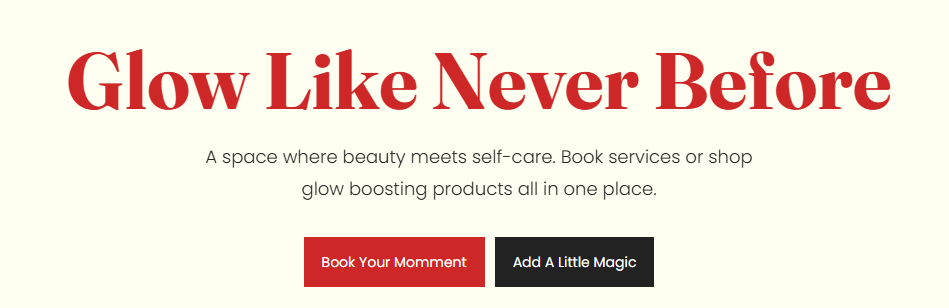
The Rich text section is a flexible text-content area designed for headings, descriptions, and call-to-action buttons. It includes layout controls for container width, optional scroll-fade animation, text alignment, color scheme, and responsive spacing. The preset structure supports a tagline, heading, a width-limited text group, and a button group.
Section Configuration:
Layout
| Setting |
Description |
| Container layout |
Controls how the section is sized on the page: page-width (boxed), contained-content, or container-fluid (full width). |
| Container size (Desktop) |
Sets the maximum section width on desktop as a percentage (50%–100%). |
| Scroll fade animation |
When enabled, applies a fade-in effect to the section as it enters the viewport. |
| Text alignment (Desktop) |
Controls text alignment on desktop (left, center, right). |
| Text alignment (Mobile) |
Controls text alignment on mobile (left, center, right). |
| Color scheme |
Applies a theme color scheme to the section styling. |
Inner padding
| Setting |
Description |
| Top (Desktop) |
Adds space above the section’s inner content on desktop. |
| Bottom (Desktop) |
Adds space below the section’s inner content on desktop. |
| Left (Desktop) |
Adds space to the left of the section’s inner content on desktop. |
| Right (Desktop) |
Adds space to the right of the section’s inner content on desktop. |
| Top (Mobile) |
Adds space above the section’s inner content on mobile. |
| Bottom (Mobile) |
Adds space below the section’s inner content on mobile. |
| Left (Mobile) |
Adds space to the left of the section’s inner content on mobile. |
| Right (Mobile) |
Adds space to the right of the section’s inner content on mobile. |
Outer padding
| Setting |
Description |
| Top (Desktop) |
Adds space above the section (outside the section content) on desktop. |
| Bottom (Desktop) |
Adds space below the section (outside the section content) on desktop. |
| Left (Desktop) |
Adds space on the left side of the section (outside) on desktop. |
| Right (Desktop) |
Adds space on the right side of the section (outside) on desktop. |
| Top (Mobile) |
Adds space above the section (outside) on mobile. |
| Bottom (Mobile) |
Adds space below the section (outside) on mobile. |
| Left (Mobile) |
Adds space on the left side of the section (outside) on mobile. |
| Right (Mobile) |
Adds space on the right side of the section (outside) on mobile. |
Blocks Configuration:
Section-level blocks
| Block type |
Description |
| Width group |
Adds a container that limits the width of its child content for improved readability. |
| Buttons group |
Adds a container for one or more buttons, with layout and spacing controls. |
Theme block (@theme ) |
Allows theme-provided blocks to be added to this section (based on what your theme supports). |
App block (@app ) |
Allows compatible Shopify apps to add app blocks to this section. |
Tagline
| Setting |
Description |
| Text |
Sets the tagline text displayed above the main heading. |
| Text size |
Controls the size preset used for the tagline. |
| Text weight |
Controls the font weight used for the tagline. |
| Text case |
Controls capitalization styling for the tagline. |
| Margin (Desktop) |
Adds space above/below the tagline on desktop. |
| Margin (Mobile) |
Adds space above/below the tagline on mobile. |
Heading
| Setting |
Description |
| Text |
Sets the main heading text. |
| Heading size |
Controls the visual size preset of the heading. |
| Heading weight |
Controls the font weight used for the heading. |
| Heading tag |
Selects the HTML heading level (H1–H6) used for the heading. |
| Heading case |
Controls capitalization styling for the heading. |
| Heading font family |
Selects the font preset used for the heading (theme default or body font). |
| Link styles |
Controls how links appear if the heading contains linked text (theme preset style). |
| Margin (Desktop) |
Adds space above/below the heading on desktop. |
| Margin (Mobile) |
Adds space above/below the heading on mobile. |
Width group
| Setting |
Description |
| Max width (Desktop) |
Sets the maximum width of the grouped content on desktop (percentage-based). |
| Max width (Mobile) |
Sets the maximum width of the grouped content on mobile. |
Width group: block (Description)
| Setting |
Description |
| Text |
Sets the rich text description content. |
| Text size |
Controls the size preset used for the description. |
| Text weight |
Controls the font weight used for the description. |
| Text case |
Controls capitalization styling for the description. |
| Margin (Desktop) |
Adds space above/below the description on desktop. |
| Margin (Mobile) |
Adds space above/below the description on mobile. |
| Setting |
Description |
| Layout (Desktop) |
Sets how buttons are arranged on desktop (row or column). |
| Layout (Mobile) |
Sets how buttons are arranged on mobile (row or column). |
| Wrap (Desktop) |
Allows buttons to wrap to a new line on desktop when space is limited. |
| Wrap (Mobile) |
Allows buttons to wrap to a new line on mobile when space is limited. |
| Justify (Desktop) |
Controls horizontal distribution of buttons on desktop. |
| Justify (Mobile) |
Controls horizontal distribution of buttons on mobile. |
| Alignment (Desktop) |
Controls vertical alignment of buttons within the group on desktop. |
| Alignment (Mobile) |
Controls vertical alignment of buttons within the group on mobile. |
| Gap (Desktop) |
Sets spacing between buttons on desktop. |
| Gap (Mobile) |
Sets spacing between buttons on mobile. |
| Margin (Desktop) |
Adds space above/below the button group on desktop. |
| Margin (Mobile) |
Adds space above/below the button group on mobile. |
| Setting |
Description |
| Label |
Sets the text shown on the button. |
| Button style |
Selects the button style (for example, Primary or Secondary styling depending on your theme). |
| Text case |
Controls capitalization styling for the button label. |
| Margin (Desktop) |
Adds space above/below the button on desktop. |
| Margin (Mobile) |
Adds space above/below the button on mobile. |
