Signature collection
Overview:
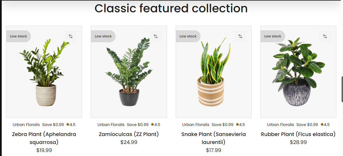
The Classic Featured Collection section displays a curated selection of products from a chosen collection in a flexible grid or slider layout. It supports rich customization options, including heading content, product card design, button layouts, and advanced display settings for mobile and desktop.
Section Configuration:
Collection Source
| Setting | Description |
|---|---|
| Collection | Select the collection from which products will be displayed. |
Heading and Description
| Setting | Description |
|---|---|
| Heading | Text displayed as the section title. |
| Heading Size | Choose the visual size of the heading text. |
| Description | Text content shown beneath the heading. |
| Text Size | Choose the font size for the section description. |
| Text Alignment | Align heading and description (left, center, or right). |
View More Button
| Setting | Description |
|---|---|
| Enable Button | Toggle to show a "View More" button linking to the full collection. |
| Button Label | Customize the button text. |
| Button Style | Choose between primary or secondary button styling. |
Grid Configuration
Desktop Grid
| Setting | Description |
|---|---|
| Columns on Desktop | Set the number of product columns shown on desktop. |
| Rows on Desktop | Set the number of product rows shown on desktop. |
Mobile Grid
| Setting | Description |
|---|---|
| Columns on Mobile | Set the number of product columns shown on mobile devices. |
| Responsive Width Trigger | Define the minimum screen width (in px) before switching column layout. |
Product Card Options
| Setting | Description |
|---|---|
| Media Size | Define how product images are displayed (adapt, square, portrait, landscape). |
| Show Variant Options | Toggle to show variant selectors in product cards. |
| Show Product Title Above | Display product title at the top of the product card. |
| Show Rating | Display star ratings if reviews are enabled. |
| Show Discount Badge | Show the discount percentage or badge if applicable. |
| Show Vendor | Show the product's vendor name. |
| Show Compare Price | Show the original price alongside the sale price. |
| Show Inventory Status | Display stock level or availability. |
| Show Second Image on Hover | Enable hover to reveal secondary product image. |
Button Layout
| Setting | Description |
|---|---|
| Button Layout | Choose what buttons (add to cart, quick view, etc.) appear on the product card. |
| Enable Button Overlay | Show product card buttons as an overlay instead of below the card. |
Image Thumbnails
| Setting | Description |
|---|---|
| Thumbnail Style | Choose how thumbnails are displayed (media gallery, variant gallery, none). |
| Max Thumbnails | Set how many thumbnails to show. |
| Show Available Only | Only display thumbnails for available variants. |
Slideshow Options
| Setting | Description |
|---|---|
| Enable Slideshow | Display products in a horizontal slider instead of a grid. |
| Show Navigation | Display previous/next arrows in the slideshow. |
| Show Pagination | Display pagination dots in the slideshow. |
Layout and Styling
| Setting | Description |
|---|---|
| Remove Border Radius | Remove rounded corners from the section container. |
| Enable Border (Cards) | Toggle a border around each product card. |
| Top Border | Add a border to the top of the section. |
| Bottom Border | Add a border to the bottom of the section. |
| Text Alignment (Cards) | Set alignment of content inside product cards (left, center, right). |
| Color Scheme | Select the color scheme used for this section. |
Spacing
| Setting | Description |
|---|---|
| Top Padding | Add vertical spacing above the section. |
| Bottom Padding | Add vertical spacing below the section. |