Featured blog
Overview:
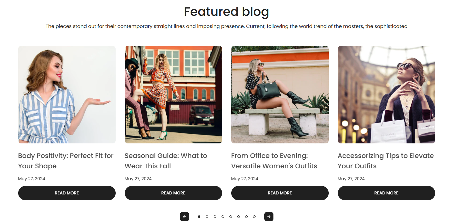
The Featured Blog section allows you to display a curated list of blog posts from a selected blog. This section supports both static grid and slideshow display formats and offers several configuration options, including blog metadata display and layout customization for different devices.
Section Configuration:
Blog Source
| Setting | Description |
|---|---|
| Blog | Choose which blog to display posts from. |
Heading & Description
| Setting | Description |
|---|---|
| Heading | Add a main title for the blog section. |
| Heading Size | Select the display size of the heading text. |
| Description | Add supporting text to provide context or description for the section. |
| Text Size | Choose the font size for the description text. |
View More Button
| Setting | Description |
|---|---|
| Enable View More Button | Show a button linking to the full blog if the number of articles exceeds the section limit. |
| Button Label | Customize the label for the view more button. |
| Button Style | Choose the style for the button (Primary or Secondary). |
Grid Settings
| Setting | Description |
|---|---|
| Desktop Columns | Set the number of blog post columns to display on desktop devices. |
| Desktop Rows | Set the number of rows of blog posts to display on desktop devices. |
| Mobile Columns | Choose how many columns to show on mobile (1 or 2). |
| Mobile Column Breakpoint | Define the viewport width at which the mobile column count applies. |
Blog Card Options
| Setting | Description |
|---|---|
| Image Size | Choose the aspect ratio or behavior of the blog post image. |
| Show Featured Image | Display the main image associated with each blog post. |
| Show Tags | Display tags assigned to the blog posts. |
| Show Date | Display the publication date of each blog post. |
| Show Author | Display the name of the author for each blog post. |
| Show Excerpt | Display a short excerpt from the blog content. |
| Show Comments Count | Display the number of comments for each blog post. |
Slideshow Settings
| Setting | Description |
|---|---|
| Enable Slideshow | Toggle between a static grid and a carousel layout. |
| Autoplay | Automatically cycle through blog posts when slideshow is enabled. |
| Show Navigation Arrows | Display previous/next arrows for the carousel. |
| Show Pagination Dots | Display pagination indicators under the carousel. |
Layout & Alignment
| Setting | Description |
|---|---|
| Text Alignment (Desktop) | Align section text content on desktop (Left, Center, or Right). |
| Text Alignment (Mobile) | Align section text content on mobile (Left, Center, or Right). |
Color & Spacing
| Setting | Description |
|---|---|
| Color Scheme | Select a predefined color scheme for the section. |
| Top Padding | Add spacing above the section. |
| Bottom Padding | Add spacing below the section. |