Carousel
Overview:
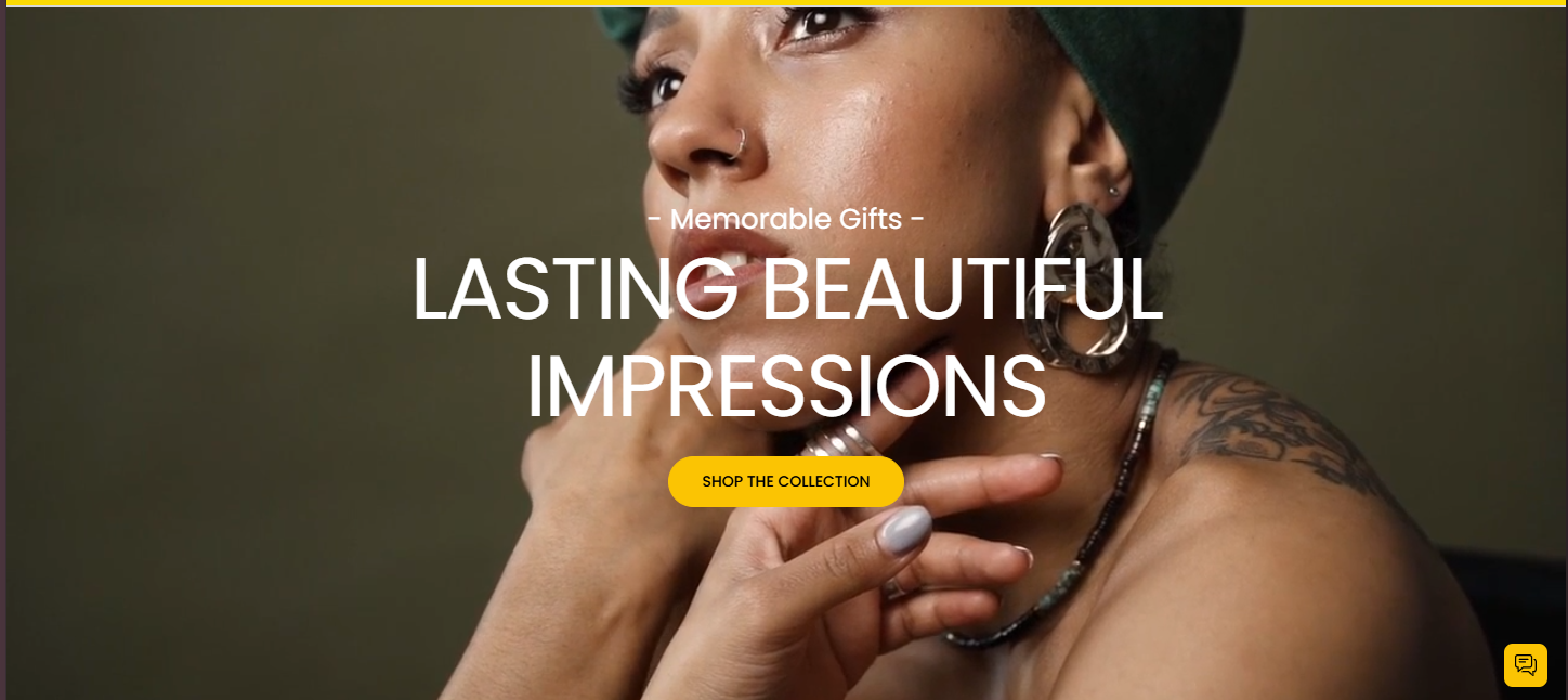
A customizable full-width image slider section used to highlight promotions, offers, or storytelling content using multiple slides. Includes autoplay, navigation, text overlays, and buttons.
Settings Configuration:
Layout & Appearance
| Setting | Description |
|---|---|
| Section Height | Select the vertical height of the carousel. Options include: Small, Medium, or Full Window Height. |
| Color Scheme | Choose a color scheme to apply to the carousel background and text areas. |
Slideshow Behavior
| Setting | Description |
|---|---|
| Autoplay | Enable automatic slide transitions without user interaction. |
| Slide Transition Type | Select between a fading or sliding transition effect. |
| Show Navigation Arrows | Toggle to display previous/next arrows on the slider. |
| Show Pagination Dots | Toggle to display pagination dots below the slider. |
| Change Slides Every | Set the time interval between automatic slide changes, in seconds. |
Block Configuration:
Block: Slide
Each slide in the carousel can be customized individually to include images, text, and buttons, providing a flexible content layout.
Image & Layout
| Setting | Description |
|---|---|
| Image | Upload an image to display as the background of the slide. |
| Full Width Container | Expand the content container to fill the entire width of the slide. |
| Add Extra Container Spacing | Add additional spacing within a full-width container. Visible only if full width is enabled. |
| Enable Content Container | Toggle to wrap slide content inside a content container. |
| Max Content Width | Define the maximum width for the content inside the slide, as a percentage. |
| Content Position | Choose where the content should appear within the slide (e.g., top left, center, bottom right). |
Text Content
| Setting | Description |
|---|---|
| Caption | Enter a short caption to appear above the heading. |
| Caption Size | Set the size of the caption text. |
| Heading | Enter the main heading for the slide. |
| Heading Size | Choose the size of the heading text. |
| Description | Provide a description or supporting text below the heading. |
| Description Size | Set the size of the description text. |
Button Settings
| Setting | Description |
|---|---|
| Wrap Buttons | Toggle to group both buttons into a single container. |
First Button
| Setting | Description |
|---|---|
| Button Label | Text to display on the first button. |
| Button Style | Choose between primary or secondary button styles. |
| Button Link | Enter a URL that the button should link to. |
| Open in New Window | Toggle to open the button link in a new browser window. |
Second Button
| Setting | Description |
|---|---|
| Button Label | Text to display on the second button. |
| Button Style | Choose between primary or secondary button styles. |
| Button Link | Enter a URL that the button should link to. |
| Open in New Window | Toggle to open the button link in a new browser window. |
Text Alignment & Color
| Setting | Description |
|---|---|
| Desktop Text Alignment | Set the alignment of text content on desktop screens. |
| Mobile Text Alignment | Set the alignment of text content on mobile screens. |
| Color Scheme | Choose a color scheme for this individual slide block. |