Collection list
Overview
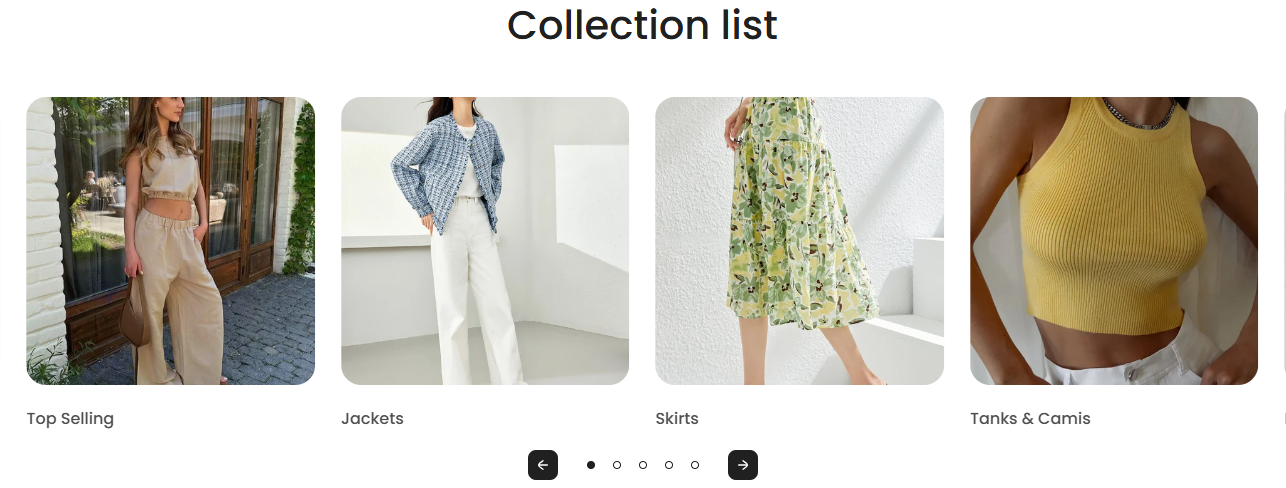
The "Collection List" section is designed to showcase multiple collections on your store’s page. This section is especially useful for highlighting different categories of products, allowing customers to easily navigate and explore various segments of your inventory.
Section Configuration:
Collection Setup
| Setting |
Description |
| Collection List |
Choose the collections you want to feature. This can include any collection set up in your Shopify store. |
Text Settings
| Setting |
Description |
| Heading |
Customize the heading text to align with the section's theme. |
| Section Heading Size |
Select the size of the heading text from four available options to ensure it fits well within your page layout. |
| Section Description |
Add a descriptive text that will appear under the heading to give more context about the collections featured. |
| Section Text Size |
Adjust the text size to ensure readability across devices. |
| Setting |
Description |
| View More Label |
Text for the button that leads to more details about the collections. |
| View More Type |
Style the button as primary (more prominent) or secondary. |
| View More Link |
URL for the button, directing users to a detailed page. |
| Open in New Window |
Option to open the link in a new browser tab. |
Design and Layout
| Setting |
Description |
| Card Media Size |
Select the aspect ratio for the images used in the collection cards to ensure they display properly. |
| Card Text Alignment |
Determine the alignment of text on the collection cards. |
| Card Text Size |
Adjust the text size on the collection cards for better visibility and aesthetics. |
Behavior and Animation
| Setting |
Description |
| Section Behavior Layout |
Choose between slideshow or scroll layout to best fit your design needs. |
| Auto Play Slideshow |
Enable slideshow auto play to keep the content dynamic without user interaction. |
| Navigation Arrows and Pagination |
Toggle the visibility of navigation controls for the slideshow. |
Color Scheme Settings
| Setting |
Description |
| Color Scheme |
Choose a predefined color scheme to ensure consistency with the store’s branding. |
| Setting |
Description |
| Marquee Speed and Direction |
Adjust how fast and in which direction the text or images scroll. |
| Marquee on Hover |
Option to pause the scrolling when the mouse hovers over the content, useful for allowing users to interact with content without missing details. |
Slideshow Settings
| Setting |
Description |
| Auto Play |
Toggle to automatically cycle through products. |
| Show Navigation Arrows |
Enable navigation arrows for the slideshow. |
| Show Pagination |
Enable pagination indicators for the slideshow. |
| Change Slides Every |
Set the interval for changing slides, enhancing dynamic interaction. |
Spacing Settings
| Setting |
Description |
| Top Padding |
Adjust the space above the section content. |
| Bottom Padding |
Adjust the space below the section content. |
