Product showcase
Overview:
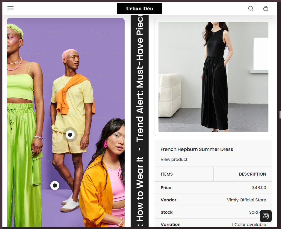
The "Product Showcase" section is designed to highlight specific products or collections in a dynamic and visually engaging manner. It includes interactive hotspots on images where users can learn more about the features of the product or collection. This section is ideal for showcasing new arrivals, bestsellers, or products with special features.
Section Configuration:
Heading and Description
| Setting |
Description |
| Heading |
Customizable heading with support for rich text to make certain words stand out. |
| Section Heading Size |
Adjustable size options for the heading to ensure it fits the design and attracts attention appropriately. |
| Section Description |
A detailed description that can further explain the showcased products or set the context for the showcase. |
Design and Layout
| Setting |
Description |
| Section Media Size |
Adjust the size and aspect ratio of images to ensure they display correctly and are optimized for engagement. |
| Section Text Size |
Control over the text size within the section to ensure readability across devices. |
| Max Header Size |
Defines the maximum width of the header as a percentage of its container, allowing for better control over the layout. |
Product Selection
| Setting |
Description |
| Product |
A selector to choose which products to feature within the showcase. This allows for a flexible and relevant presentation of products. |
Color and Style Settings
| Setting |
Description |
| Color Scheme |
Choose from predefined color schemes to align the look of the showcase with the overall store design. |
| Marquee Color Scheme |
Specifically adjust the color scheme for scrolling text elements. |
| Setting |
Description |
| Marquee Speed and Direction |
Adjust how fast and in which direction the text or images scroll. |
| Marquee on Hover |
Option to pause the scrolling when the mouse hovers over the content, useful for allowing users to interact with content without missing details. |
Spacing and Alignment
| Setting |
Description |
| Top and Bottom Padding |
Control the spacing above and below the section to integrate smoothly with other page content. |
| Text Alignment |
Global setting for text alignment within the section, affecting headers, descriptions, and possibly other textual elements. |
Blocks Configuration
Hotspot Block
| Setting |
Description |
| Enable Hotpots |
Toggle to activate interactive spots on the product images where users can click to learn more. |
| Image |
Assign an image that will feature hotpots. |
| Block Color Scheme |
Customize the color scheme for individual hotpot blocks to highlight or blend with the main image. |
| Hotpot Content |
Define the text and links for each hotpot, offering more details or connections to product pages. |
| Hotpot Positioning |
Detailed control over the position of each hotpot, ensuring they accurately point to relevant parts of the product. |
| Text Alignment for Hotpots |
Manage how text is aligned within the hotpots for consistency and aesthetics. |
Scroll Text Block
| Setting |
Description |
| Text |
Define the text that will scroll across the section, typically used for catchy phrases, key benefits, or calls to action. |
