Header
Overview
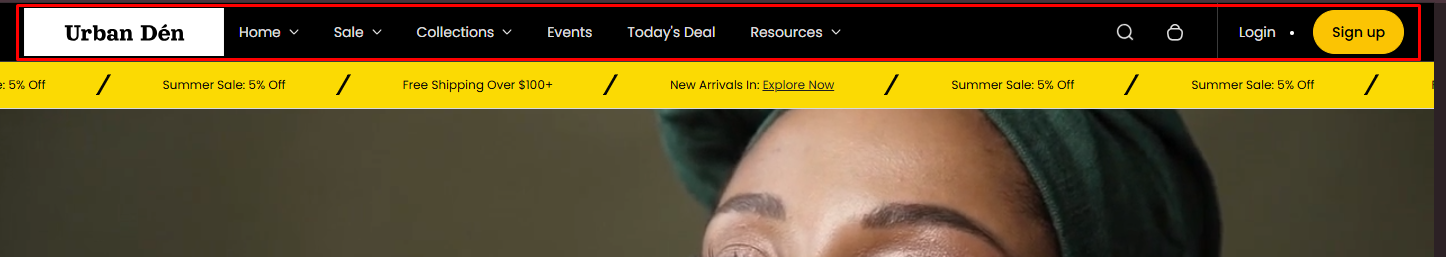
The Header section is designed to serve as the primary navigation and interaction hub at the top of your Shopify store's pages. This section is highly configurable, supporting features like search, social media links, customer account links, and shopping cart integration. It can be tailored to align with the brand’s style and functional needs.
Section Configuration:
| Setting |
Description |
| Header View |
Toggles between two header layout styles |
| Main Menu |
Select the primary navigation menu for your store |
| Second Menu |
Optionally choose a secondary navigation menu. This can be used for additional links or for special categories. |
| Show Account |
Displays login/logout or account links depending on customer status. Only shown in the alternate header view. |
| Overlay Header |
Makes the header transparent and overlays it on top of content. Useful for full-width banners. |
Social Links:
| Setting |
Description |
| Show Social Links |
A checkbox to toggle the visibility of social media links in the header. |
Logo Customization:
| Setting |
Description |
| Logo |
Upload a logo image. |
| Logo Position |
Choose between left or center alignment for the logo. |
| Logo Desktop Width |
Set the width of the logo when viewed on desktop devices. |
| Logo Mobile Width |
Set the width of the logo when viewed on mobile devices |
| Logo Spacing |
Adjust the space around the logo. |
Search Functionality:
| Setting |
Description |
| Show Search |
Toggle to enable a search bar in the header |
| Predictive Suggestions |
Enable predictive search suggestions to enhance user experience. |
| Search Banner One & Two |
Configure up to two promotional banners that can appear in the search dropdown. Each banner can have its own link and setting to open in a new window. |
| Setting |
Description |
| Show Cart |
Toggle to display the shopping cart icon. |
| Cart Position |
Choose the cart icon's position in the header, either at the top or bottom |
| Setting |
Description |
| Sticky Header |
Select the behavior of the header when scrolling. Options include none, always sticky, sticky on scroll up, or sticky on scroll. |
Aesthetic Settings:
| Setting |
Description |
| Color Scheme |
Choose a color scheme for the header to match or contrast with your store's design theme. |
| Setting |
Description |
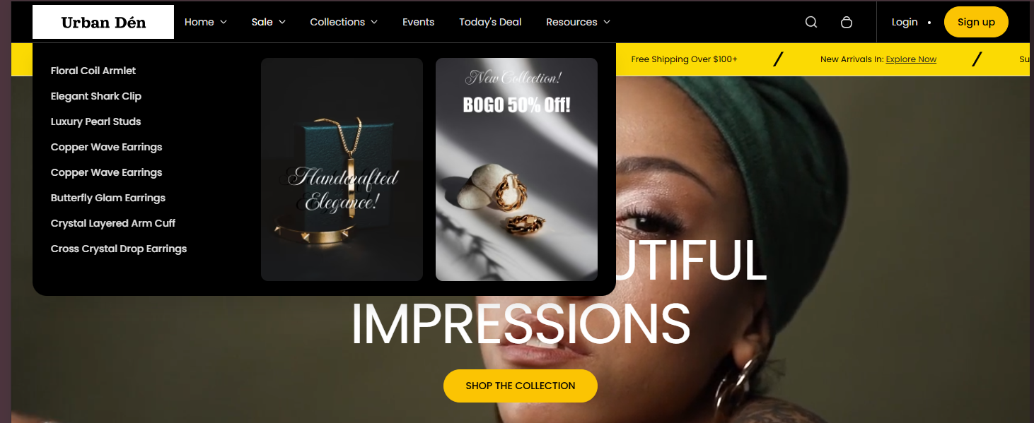
| Heading |
The navigation title this mega menu block corresponds to. |
| First Image |
First image in the mega menu dropdown. |
| First URL |
Link for the first image. |
| Open First Link in New Window |
Opens first image link in new tab. |
| Second Image |
Second image in the mega menu dropdown. |
| Second URL |
Link for the second image. |
| Open Second Link in New Window |
Opens second image link in new tab. |
| Setting |
Description |
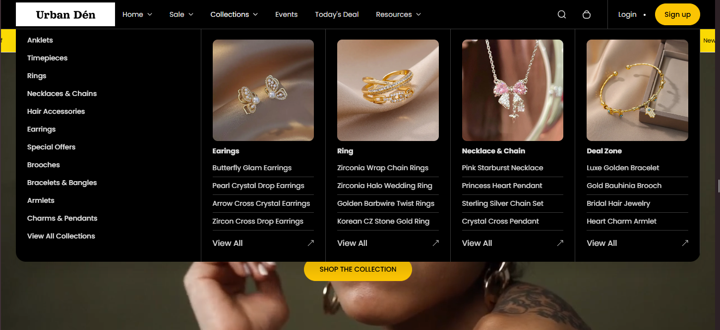
| Heading |
The navigation title this mega menu block corresponds to. |
| Collections |
Select up to 4 collections to display in the mega menu dropdown. |


